9 Tips For Creating Killer Ecommerce Landing Page + Examples


Are you an ecommerce beginner looking to create a successful online business while creating a stunning eCommerce landing page?
Discover the key elements that make a great ecommerce landing page and set yourself up for success. From captivating headlines to compelling product descriptions, I will show you the strategies that top online retailers use to convert visitors into customers.
Imagine having a landing page that not only grabs the attention of potential customers but also convinces them to make a purchase. With my expert guidance, you can create a landing page that drives sales and boosts your profits.
Now, let’s learn the secrets of successful online retailers and start building your own profitable business today!


Table of Contents
What Is An Ecommerce Landing Page?
An ecommerce landing page is a crucial component of any online store. It serves a specific purpose: to convince visitors to take a desired action.
So, whether it’s making a purchase, signing up for a newsletter, or providing their email address, the goal is to convert potential customers into actual buyers.
Unlike main store pages, ecommerce landing pages are designed to be separate and distinct. They are where visitors land from various sources such as social media, email campaigns, or search engine results. The objective is to provide a focused and targeted experience that drives conversions.
By providing a seamless and intuitive experience, an ecommerce landing page can help guide visitors through the conversion funnel, ultimately leading to more sales and happy customers. Now, let’s see what makes a great ecommerce landing page!
👉 Check out the 19 Best Strategies To Improve Your Product Page Optimization.

Build your dropshipping business with the right guidence
In just 7 days you will have everything you need to start & scale a life-changing dropshipping brand
Get started for freeWhat Makes A Great Ecommerce Landing Page?
A great ecommerce landing page has several key elements.
➡ Clean and visually appealing design: It should look good and match the overall branding of the ecommerce site.
➡ Clear and compelling call to action: Use prominent buttons like “Buy Now” or a sign-up form for a newsletter. This guides visitors to take the desired action, whether it’s making a purchase or providing their contact information.
➡ Concise and persuasive product descriptions: Include high-quality images that show the products in the best possible way.
➡ Mobile optimization: Make sure the landing page works well on mobile devices, as many consumers access ecommerce sites through their smartphones or tablets.
For example, if you’re selling handcrafted jewelry, your landing page should feature stunning photos of the jewelry, a clear “Buy Now” button, and concise descriptions that highlight the uniqueness and quality of each piece.
Plus, it should look great and function smoothly on both desktop and mobile devices.
Now, let’s discuss this in more detail.


Different Types Of Ecommerce Landing Pages
In fact, there are different types of landing pages. Namely, an ecommerce landing page created for first-time visitors that just want to become familiar with the brand is different from a page created for existing customers.
In a nutshell, as a dropshipping store owner, you need to create different landing pages for different marketing campaigns, ranging from increasing brand awareness to turning existing customers into repeat buyers. And remember that each page has a different goal.
So, let’s learn what you need! Also, I will use the Gymshark website as an example, to demonstrate to you the different landing pages.👇
1. Top Of Funnel Landing Page
Though many dropshipping businesses put most of their efforts into their home pages, there is a good chance customers might arrive on this landing page instead.
In fact, this landing page is “your front door” or the first impression about your dropshipping business. And, you know how much first impressions are important, right?
So, since this dropshipping landing page may be your new visitor’s first experience with your brand it is so important to get it right.
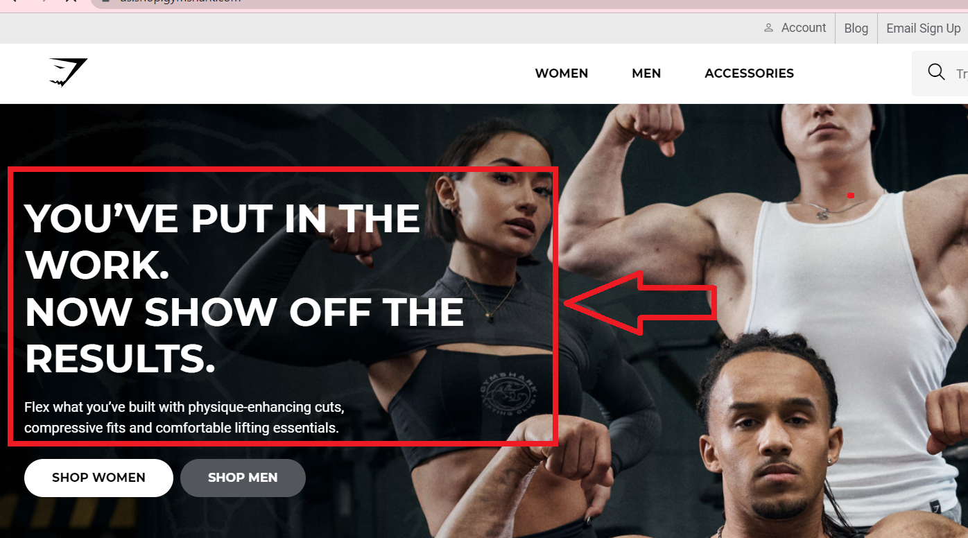
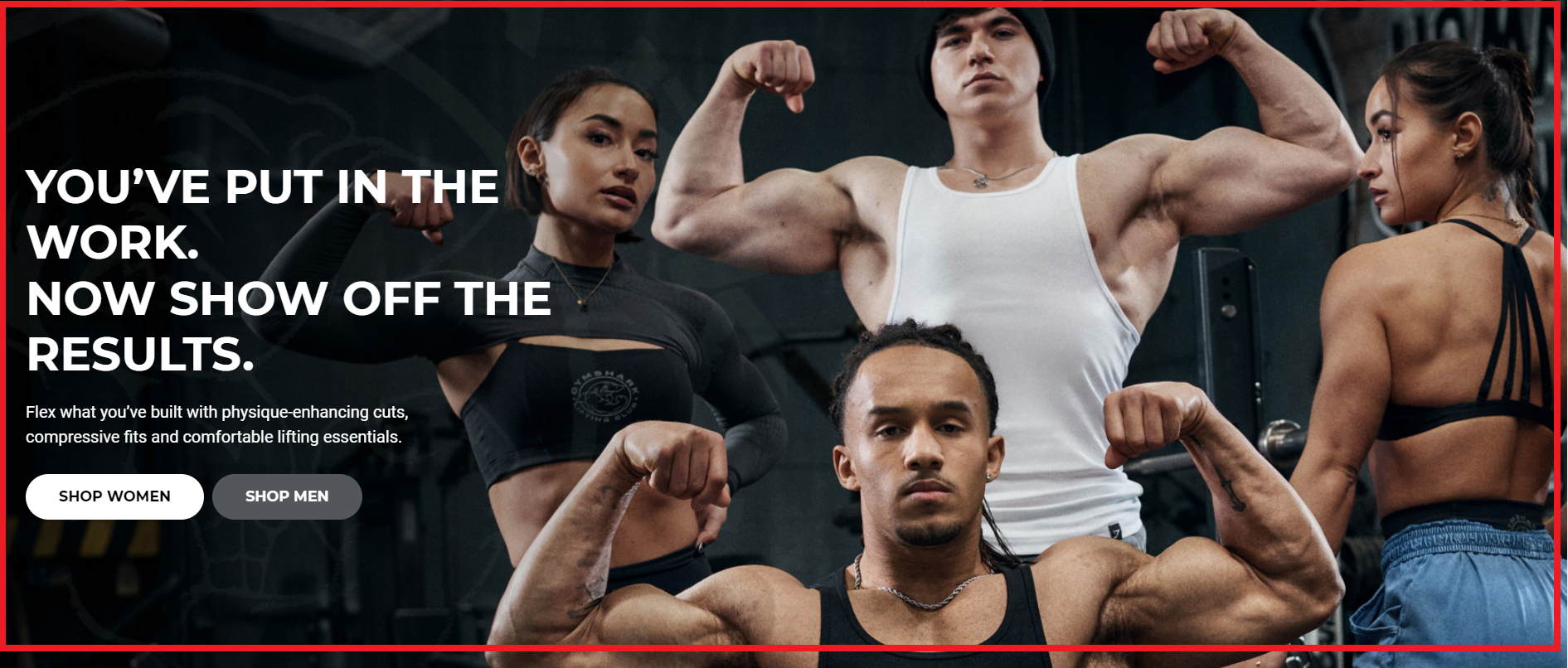
Here’s an example of a great Top funnel landing page. The Gymshark home page has all the important elements for a high-converting home page.
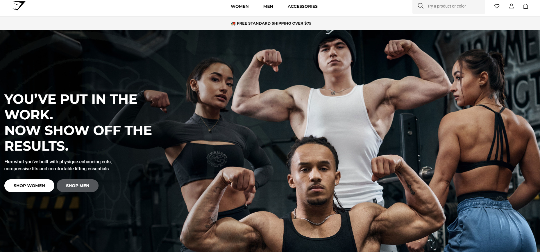
Hence, based on this, here’s what you should include to ensure it hits the mark:
➡ Unveil Your Brand Story: Connect with Your Audience
Your landing page should be more than just a product showcase. It’s an opportunity to forge a genuine connection with your audience.
Share your brand story, weaving in the passion and inspiration behind your products. By showcasing the human side of your business, you’ll capture the hearts and minds of potential customers.
➡ Offer Solutions: Address Your Visitors’ Problems
Your dropshipping products are more than just items on a virtual shelf. They have the power to solve your visitors’ problems. Paint a vivid picture of how your products can improve their lives, highlighting the unique benefits and features that set you apart from competitors.
Show your audience that you understand their pain points and have the perfect solution.
➡ Social Proof: Building Trust and Credibility
In the vast ocean of e-commerce, trust is the currency that drives conversions.
Incorporate social proof into your landing page to demonstrate that others have not only purchased from you but have also found immense value in your products.
Use customer testimonials, reviews, and ratings to showcase the positive experiences of real people. This social validation will instill confidence in your visitors, making them more likely to convert into loyal customers.
👉 Read about Testimonial Advertising: 11 Proven Examples To Sell More.
2. Mid-Funnel Landing Page
This ecommerce landing page is created for those that have visited your dropshipping site but have not made a purchase yet. Moreover, they know who you are and what you sell but are unsure whether they want your product or not.
An example of a mid-funnel landing page could be a product comparison page. This type of landing page is typically designed to provide potential customers with detailed information about different products or services offered by a business.
So, this page should include things like:
➡ Content revolving around a specific product
For instance, if you are selling a smartphone, you can create an engaging headline like, “Perfect. Inside and Out.”
➡ Limited Offers
Limited-time offers to make your visitors hurry up, buy now, or place their orders fast; (For example, you can write something like, “Get Early Access Deals with 20% Off in the Next 60 Minutes.”)
➡ Provoke Urgency
Stimulating immediate responses from your customers is an effective marketing strategy for increasing conversions and sales. As such, my advice for you is to incorporate countdown timers! Also, a CTA button with the text “Buy Now” is a great option.
➡ Social proof
To show social proof on your website, you can include testimonials. Display customer testimonials on your website, showcasing positive feedback and experiences. Also, include reviews and ratings, social media presence, certifications, badges, etc.
Remember, it’s essential to use social proof genuinely and ethically. Use real testimonials and reviews, and avoid misleading or fabricated endorsements. Social proof should be an
3. Bottom-Funnel Landing Page
This page is created for those that have visited your site and added a product to their shopping carts but left your site before completing the purchase.
An example of a bottom-funnel landing page could be a product-specific landing page that showcases a particular product or service and encourages visitors to make a purchase.
It is important to understand that those visitors are already in a buying mindset. So, it would be wise to try to close the deal first and then offer them additional items.
➡ Content revolving around products that are typically complementary to the first product
One effective way to increase sales and customer engagement is by creating content that showcases products that are commonly purchased together or are complementary to the initial product.
Yeah, I am talking about adding something like, “Frequently Bought Together.” Also, you can add content formats such as blog posts, product descriptions, etc.
By highlighting these related products, you can encourage customers to consider purchasing additional items.
➡ Bundle offers
Another effective strategy to boost sales and encourage customers to make a purchase is by offering bundle offers. For example, you can create a bundle offer like, “Buy one get two.”
By bundling together multiple products or services at a discounted price, businesses can create a sense of value and convenience for customers.
For example, as a clothing dropshipper, I offer a bundle deal where customers can purchase a complete outfit at a lower price compared to buying each item separately.
This not only incentivizes my customers to make a larger purchase but also increases the perceived value of the offer, making it more enticing.
➡ Discounts related to cart abandonment
Cart abandonment is a common challenge for drop shippers, where customers add items to their shopping cart but leave the website without completing the purchase.
To combat this issue, you can offer discounts or incentives related to cart abandonment, such as free delivery.
This can be achieved by sending personalized emails or notifications reminding customers about the items in their cart and offering the discount as an added incentive.
💡 Tip: Learn How To Recover Abandoned Carts For Shopify Dropshipping Stores.
➡ A CTA button with something like, “Make Your Order Complete”:
Including a CTA button with a phrase like “Make Your Order Complete” can create a sense of urgency and instill a feeling of satisfaction in customers by emphasizing the finality and fulfillment of completing their purchase.
This CTA button should be strategically placed on product pages, shopping carts, and checkout pages to ensure maximum visibility and encourage customers to proceed with their purchases.
👉 Check out the Top 11 Shopify Checkout Apps: How to Optimize Your Checkout Page?
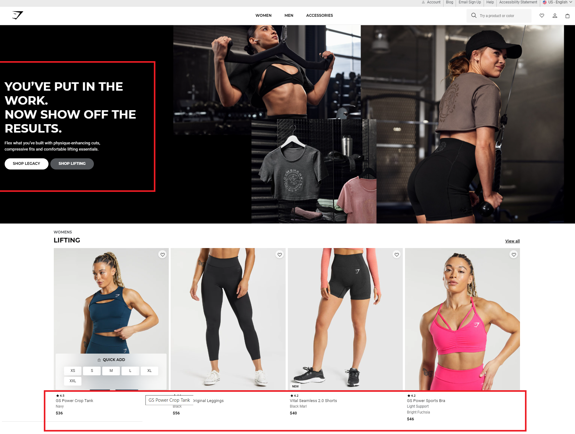
4. Customer Retention Landing Page
The goal of this ecommerce landing page is to keep your existing customers coming back to your dropshipping store.
As the content of this page is primarily intended to target your existing customers, it is not necessary to put too much importance on what your business is about. Your existing customers already know who you are and what you sell.
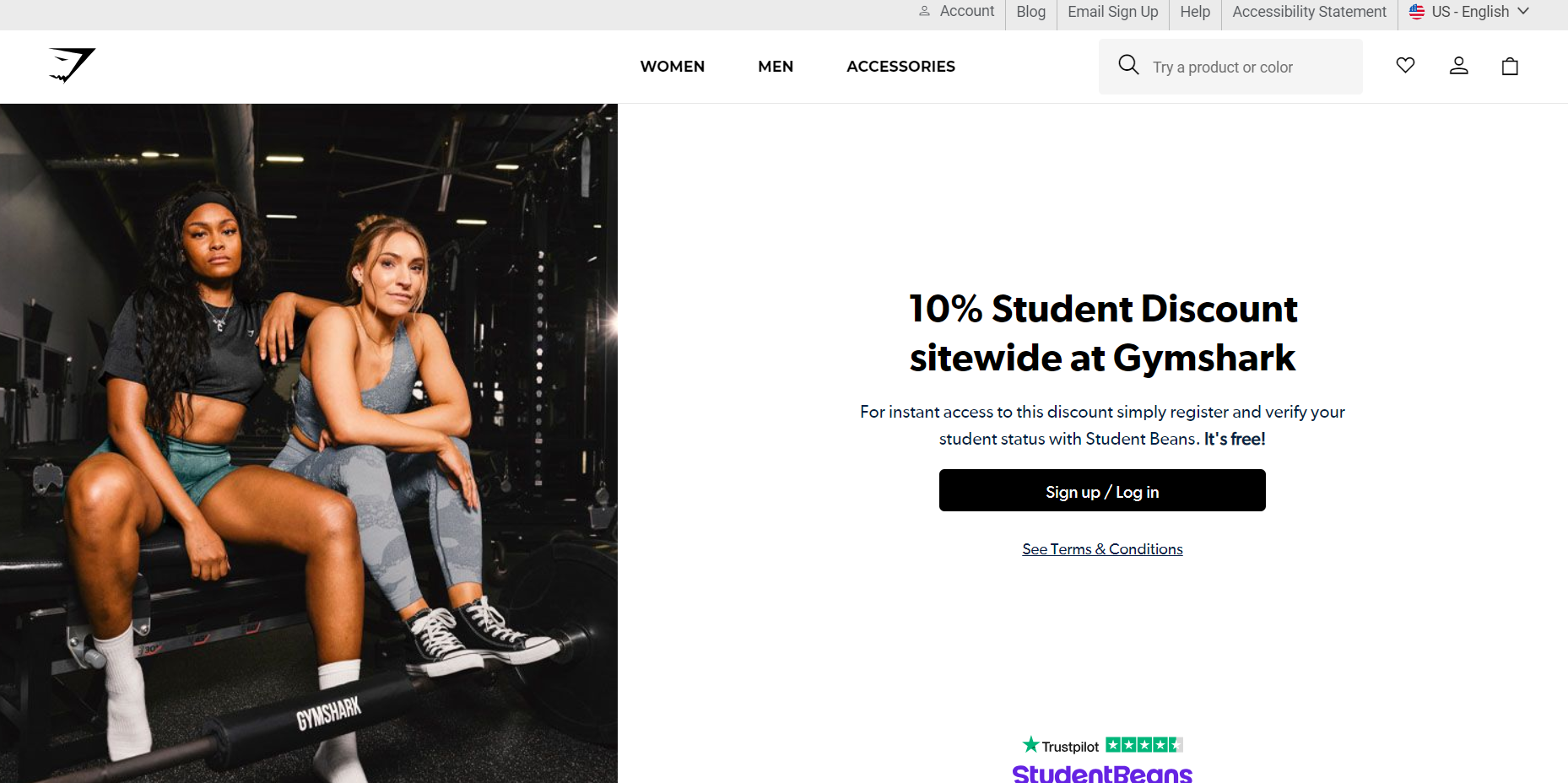
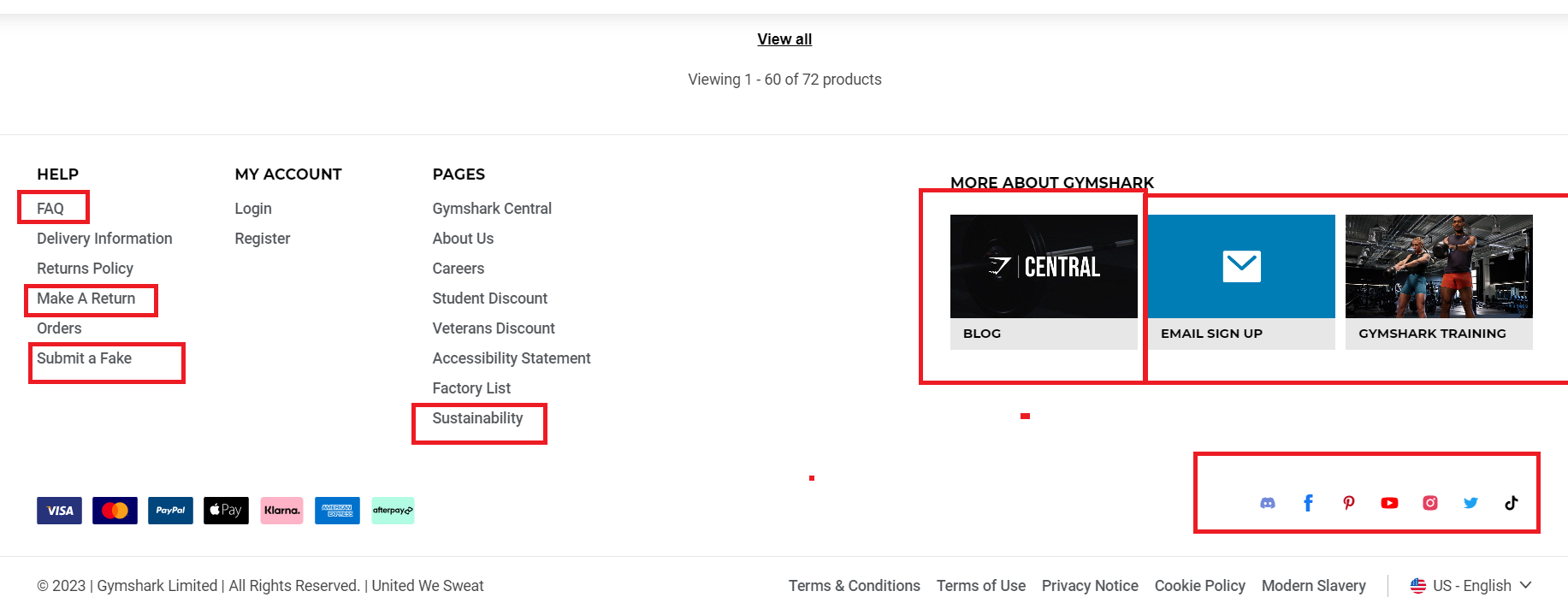
An example of this on the Gymshark website is their pages that offer an exclusive discount code, such as the Students discount and Veterans discount.
Thus, you need to strengthen your connection with them and encourage them to buy from you over again.
Ensure this page includes:
- Promotions;
- Top-selling or best-performing dropshipping products;
- Category pages featuring products based on what your existing customers have bought previously;
- Customer loyalty, rewards, or referral programs (e.g., discount coupons and rewards);
- ➡A CTA button with something like, “Refer a Friend. Enjoy 15% Off Your Next Purchase.”
9 Must-Know Tips For Designing A High-Converting Ecommerce Landing Page
With a dropshipping landing page, less is more. Remember that your landing page should be more actionable than educational.
💎 DON’T MISS: 10 Ecommerce Trends for Shopify Themes Design.
So, here are a few general dropshipping tips on how to design a high-converting dropshipping landing page, regardless of whether your aim is to attract new customers or retain the existing ones:
➡ Create a Simple And Attention-Grabbing Headline
There is no doubt that your headline is the first thing your visitor notices when they land on your page. That’s why it is imperative to make a great first impression with your headline. You would better do so, otherwise, your visitor will leave the page.
Therefore, a short, eye-catching headline will grab the attention of your visitor or customer without distracting them. Moreover, it will entice them to stay on the page.
Thus, when creating your headline, be as specific and clear as possible. Limit the number of words to only the most essential description. And make sure your headline concisely communicates the value of your offer.
Simply focus on your headline and a short descriptor. Both must speak to what you are offering and how it can improve your visitor’s life. Needless to say, your headline must match the rest of your campaign.
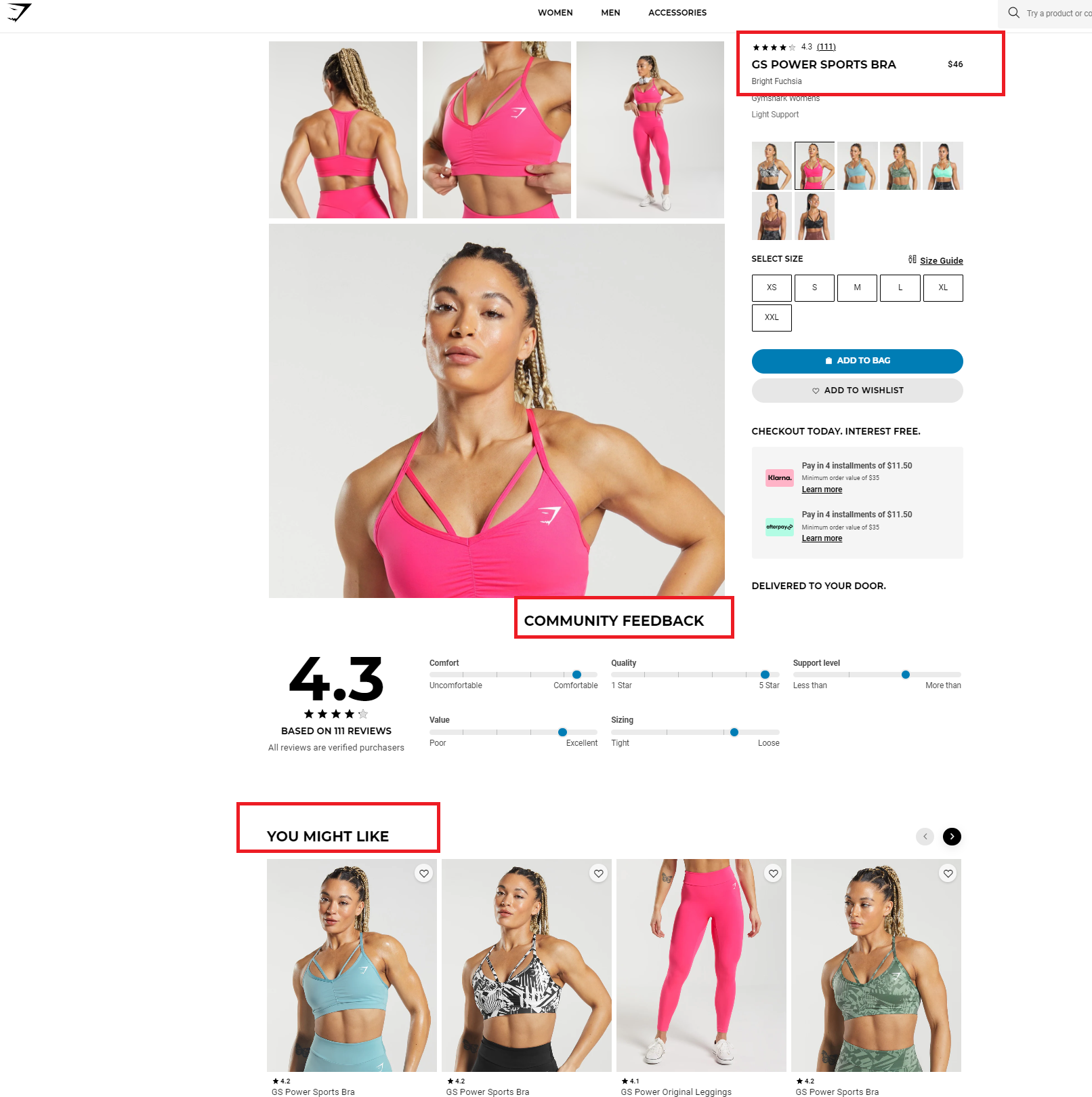
➡ Delivers The Right Message To Visitors
Additionally, the landing page should deliver the right message to visitors. It should clearly communicate the value and benefits of the product or service being offered.
For instance, using persuasive copy and high-quality product images, you can effectively showcase what sets your offering apart from the competition. Just like Gymshark does. 👇
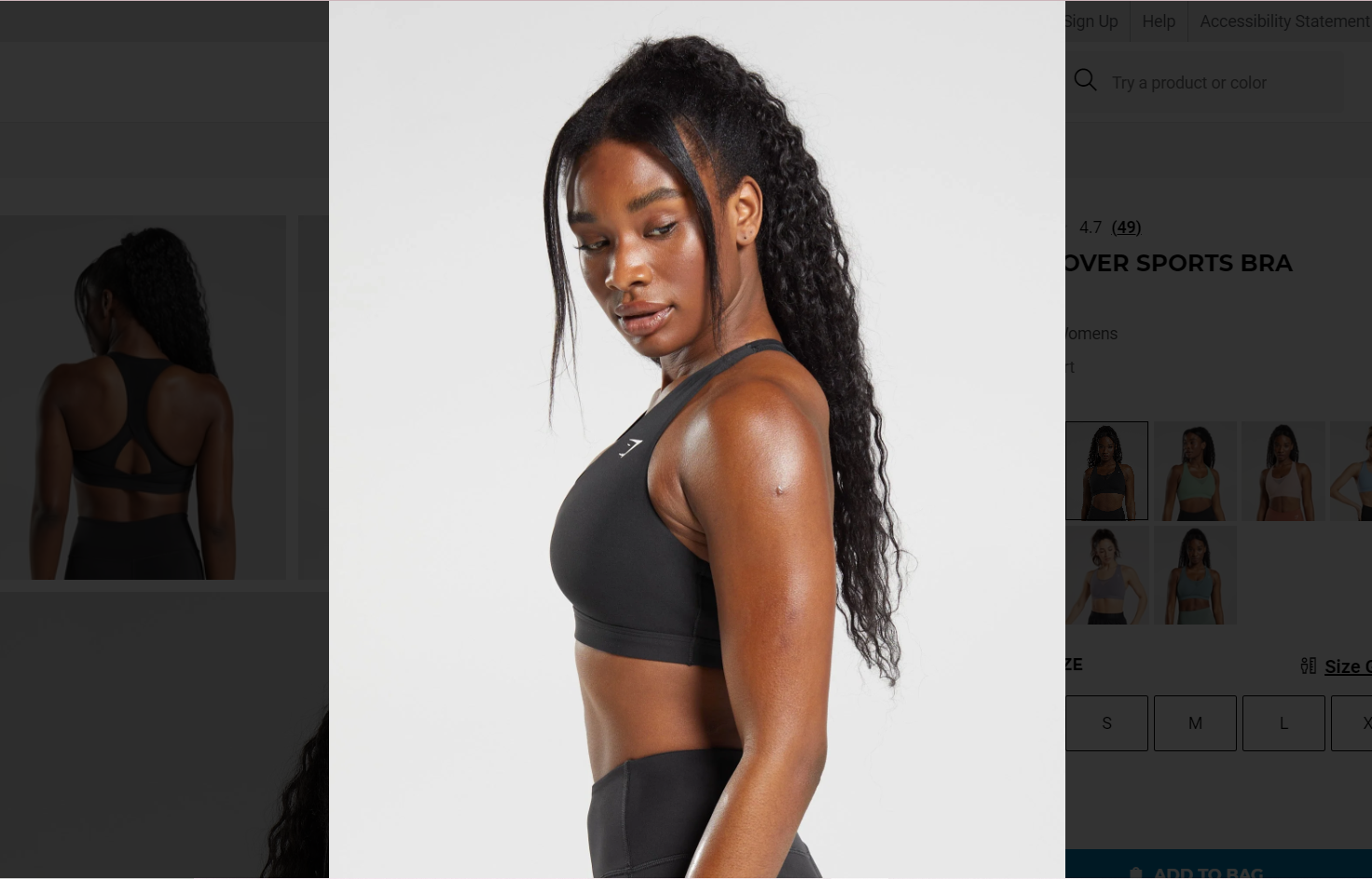
This helps your visitors quickly understand what they can expect from the page and encourages them to stay and explore further.
➡ Add One Clear CTA Button
A prominent and well-designed call-to-action is essential for guiding visitors toward the desired action, such as making a purchase or signing up for a newsletter. The CTA should be clear, persuasive, and easily distinguishable from other elements on the page to encourage conversions.
However, if you display multiple CTA buttons, it will reduce the power of your ecommerce landing page. This is why you need to give your prospective or existing customers only one or two options to focus their attention on.
Plus, ensure your CTA button is large. You also need to use eye-catching colors that stand out from the background of your page.
➡ Upload One High-Quality Background Image
Selecting the right images is one of the most crucial aspects of building a high-converting ecommerce landing page. Hence, your page should be visually enticing and look professional.
In addition, your images should convey that your dropshipping business is reputable and trustworthy. Therefore, stick to your color scheme and upload only one high-quality, relatable background image.
However, one of the most significant factors affecting landing page images is their size. Keep in mind that the size of your image can dramatically decrease the speed at which your landing page loads in your visitor’s browser.
💡 Tip: Learn How To Optimize Shopify Image Sizes In 2024 + Pro Tips.
➡ Mobile Responsiveness
With the increasing use of mobile devices for online shopping, it is crucial for an ecommerce landing page to be mobile-friendly.
The page should adapt to different screen sizes and load quickly on mobile devices to provide a seamless and enjoyable browsing experience for mobile users.
➡ Easy navigation
This one is a MUST! Imagine yourself in the middle of the woods, with no signs or roadmap, or google maps to show your way. You will get lost. Now, imagine your dropshipping store as this wood and the customer is you.
So, that’s why having intuitive navigation that allows visitors to easily find the information they are looking for is crucial.
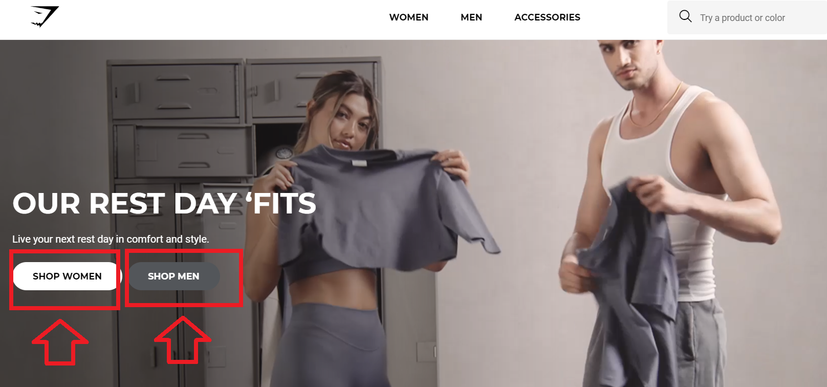
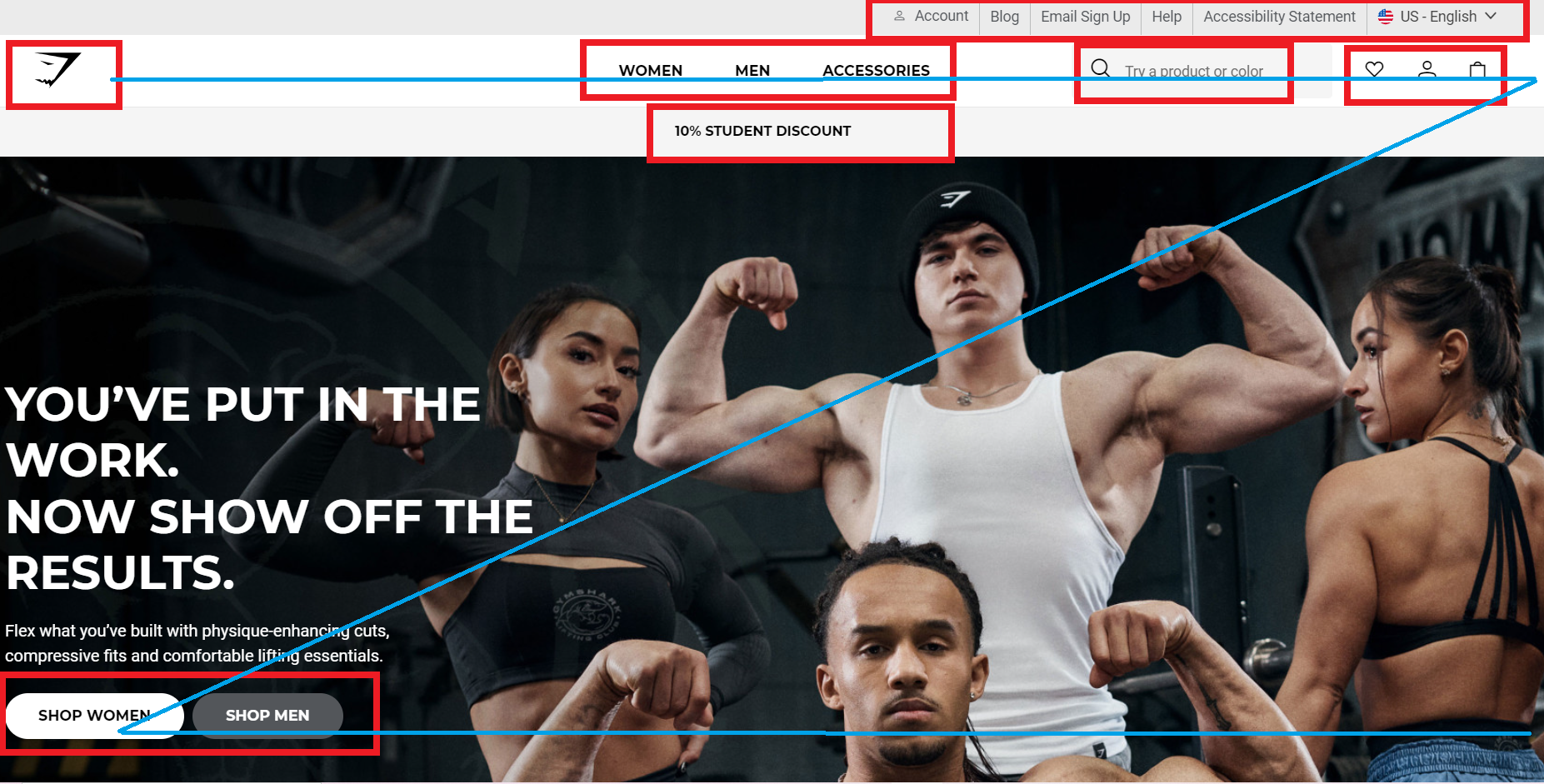
For example, look how Gymshark uses the Z-pattern to present easy navigation, starting from the logo, then the navigational menu, and all other buttons.
So, what can you do? Using clear headings, logical organization, and a user-friendly interface contribute to a positive user experience and encourage visitors to stay longer on the page.
Let’s suppose that a girl has an upcoming birthday celebration and likes to buy a new stunning dress. And she searches on Google for “Best special occasion dresses”. In the Google search results, she clicks on a link with the title “Special occasion dresses for a memorable night”.
When she lands on the page, she sees a headline that matches the ad (“It is your day to shine! You deserve a unique dress.” There are also high-quality photos of beautiful dresses on the page and a CTA button offering a promo code for a 15% discount.
And, that’s when you got yourself a potential customer!
➡ Add Social Proof
When a person lands on your landing page, they have no idea if your offer is any good. But if they see that those who have consumed your offer are happy with it, that person is more likely to trust you.
And adding social proof to your landing page for dropshipping can be a smart move. The most common forms of social proof include customer testimonials, reviews, case studies, embedded social media posts, etc.
➡ Fast Loading Speed
Slow loading times can lead to high bounce rates and a negative user experience. Therefore, optimizing the landing page for fast loading speed is crucial.
Furthermore, having multiple landing pages on your site is crucial. By tailoring landing pages to specific buyer personas or product categories, you can provide a more personalized experience to visitors.
This helps to increase engagement and ultimately drive more conversions.
➡ Make Sure Your Page Is Distraction-Free
With human attention spans growing shorter nowadays, it does not take much to get distracted by other content and leave your page.
So, you should remove any potential distractions from your ecommerce landing page if you want it to be a high-converting one.
Ensure you remove any distractions like navigation/menu links to keep your visitors or customers focused on your offer. And your CTA button should be the only available next step.
Now, let’s review all these tips through real examples from High converting ecommerce landing pages. 👇
3 High-Converting Ecommerce Landing Page Examples
Now, I will share with you 8 examples of high-converting ecommerce landing pages that will help you see what a good landing page should look like.
💡 Tip: Learn How to Build an Ecommerce Website from Scratch – My Process.
1. Nutriseed
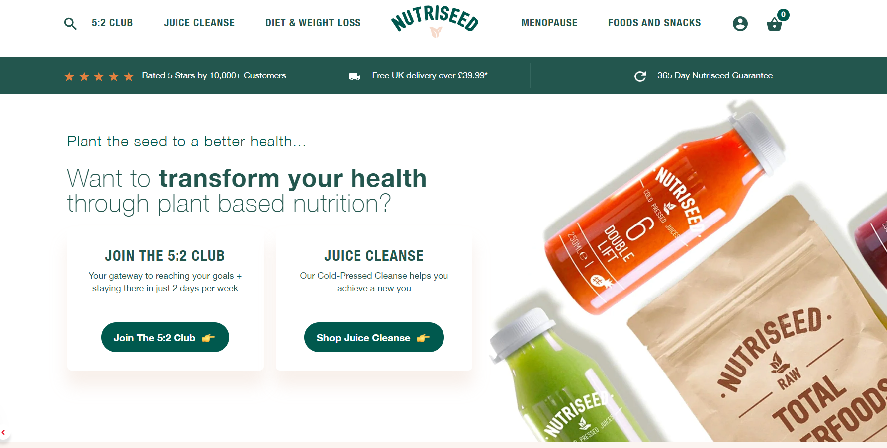
Nutriseed is an online store that specializes in selling nutritional products. Its visually appealing and user-friendly design makes it an excellent example for your own dropshipping business.
The homepage alone is responsible for 90% of customer satisfaction, thanks to its vibrant colors, clean layout, simplicity, and overall freshness. Hence, the Featured Image Layout is a fantastic choice for your business.
In addition to the captivating background photo, the homepage features strategically placed call-to-action buttons that serve as focal points. These buttons not only enhance the visual appeal but also direct customers to specific landing pages within the dropshipping store.
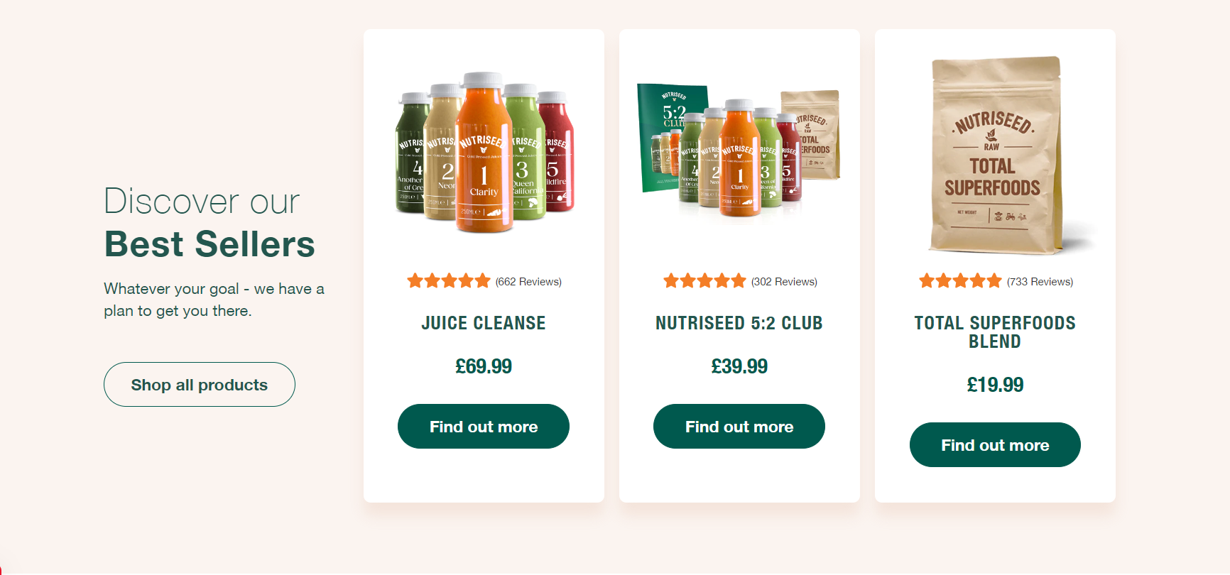
Furthermore, Nutriseed effectively utilizes a grid of card layouts on its homepage and other landing pages. This layout ensures an equal distribution of text, photos, and videos, providing users with clarity and allowing them to easily navigate to their desired content.
To enhance user experience, Nutriseed employs a horizontal fly-out menu that includes well-organized categories and sub-categories. Users can easily understand what information they will find under each specific category, enhancing their browsing experience.
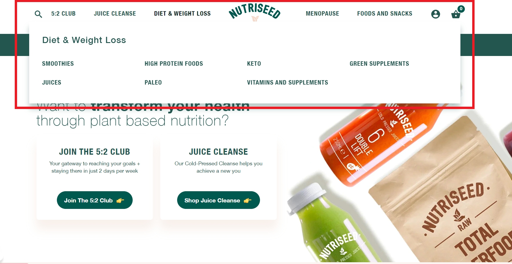
Moreover, Nutriseed incorporates all essential navigation elements, such as the logo, log in/sign up button, shopping cart button, search button, currency conversion button, and support. These elements are strategically placed for easy access by users, ensuring a seamless browsing experience.
2. Watch Gang
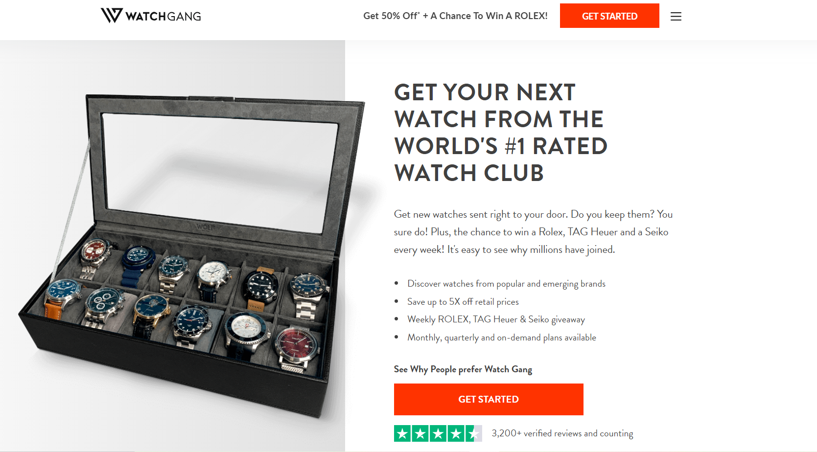
Here’s what I love about these store ecommerce landing pages. First things first, the homepage offers a symmetrical design. Hence, at the same moment, customers can see the products, and read a short captivating description about them.
Also, not just that it has call-to-action buttons, but they also use eye-catchy coloring to grab users’ attention – “Hey, this is what you need to do”
Moreover, I love their interesting and creative headlines. And there is a clear, contrasting CTA button on the page.
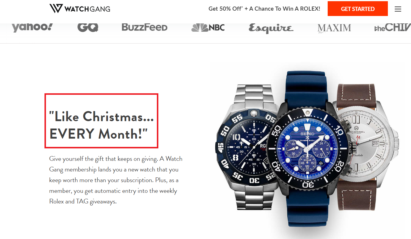
And, since I talk about headlines, another technique got my attention – their “Wheel” marketing tactic. It is a great way to make your customers more engaged. Plus, you give them an idea of what is next on their “buy list”.
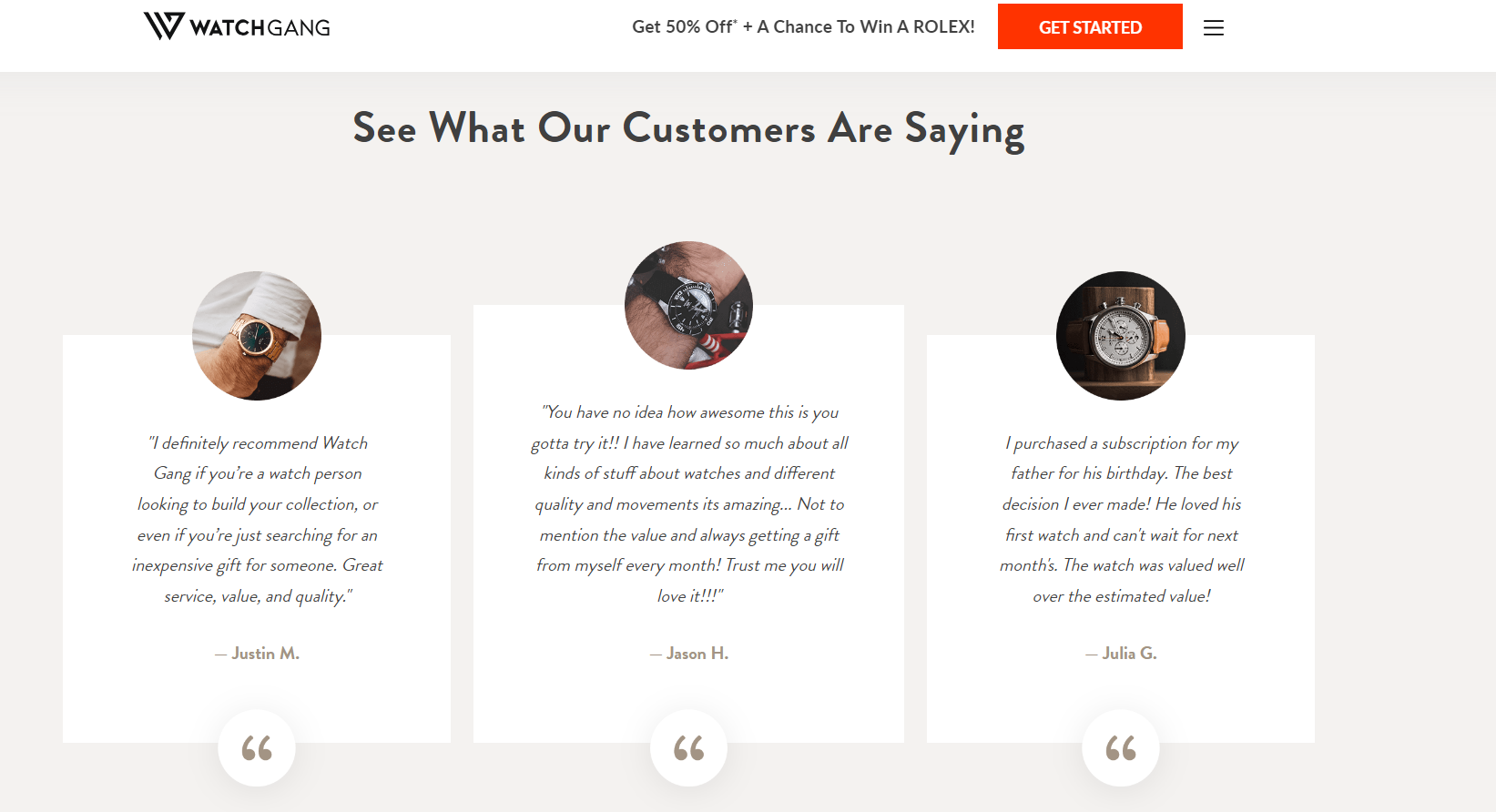
Also, if you scroll down, you can see customer testimonials at the bottom of the landing page. This may just add more weight to the purchase decision.
However, here’s what I don’t like. Not a single button on the home page leads to their product pages. And, their main goal is to sell more. So, don’t do that.
Also, you have to make several clicks to get to their product page. Plus, once you find the button to access this ecommerce landing page, you are redirected to another link. So, all this is a bit confusing.
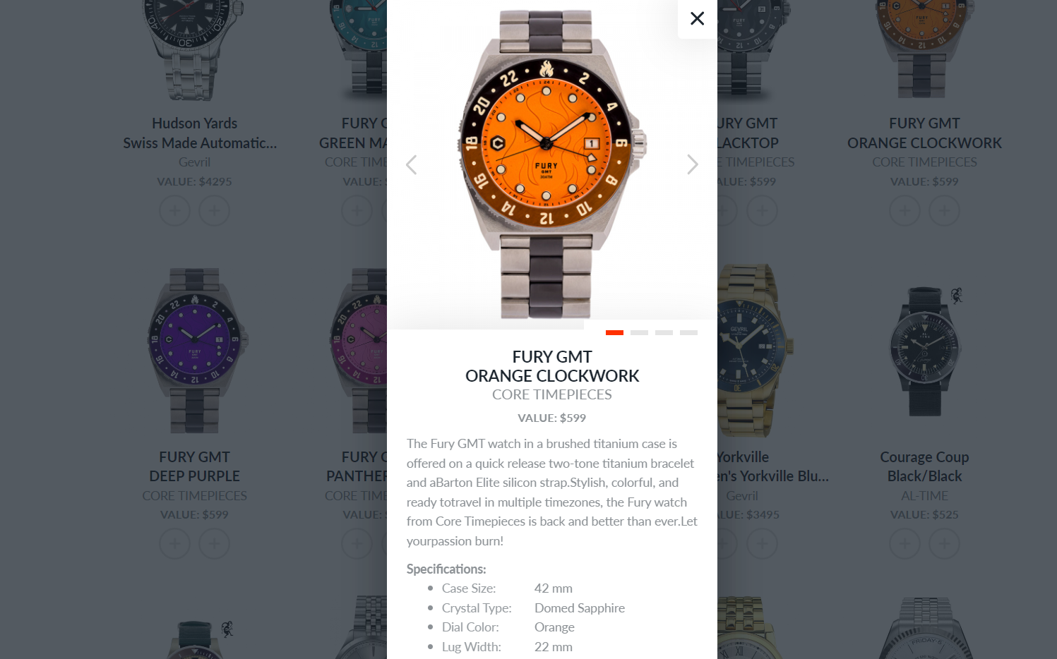
But, once you do, the product page is decent, including all needed elements like high-quality photos, product descriptions, call-to-action buttons, and customer reviews. etc.
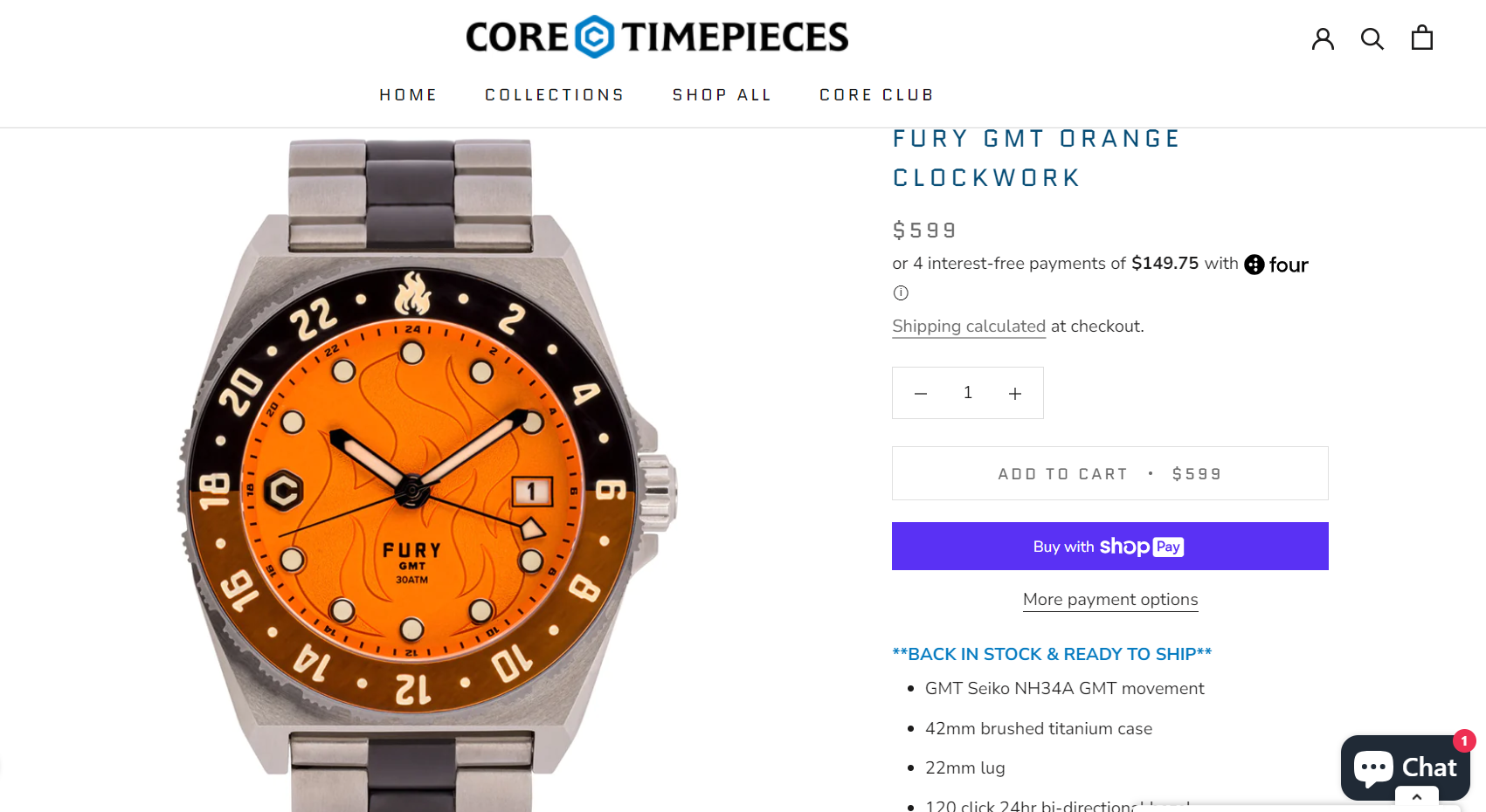
Also, the menu is not very visible. It is actually placed in the right upper corner (which is not common for the menu button). It is a drop-down menu, with a few categories.
💡 Tip: Read about Dropshipping Watches: 10 Best Watch Suppliers and Products to Dropship [+Pro Tips].
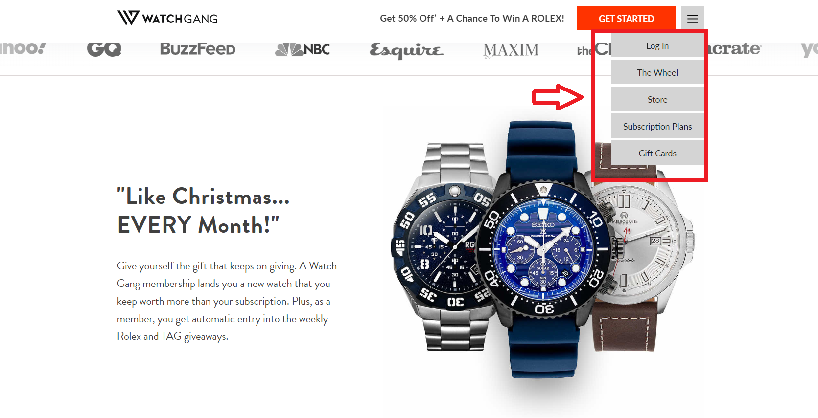
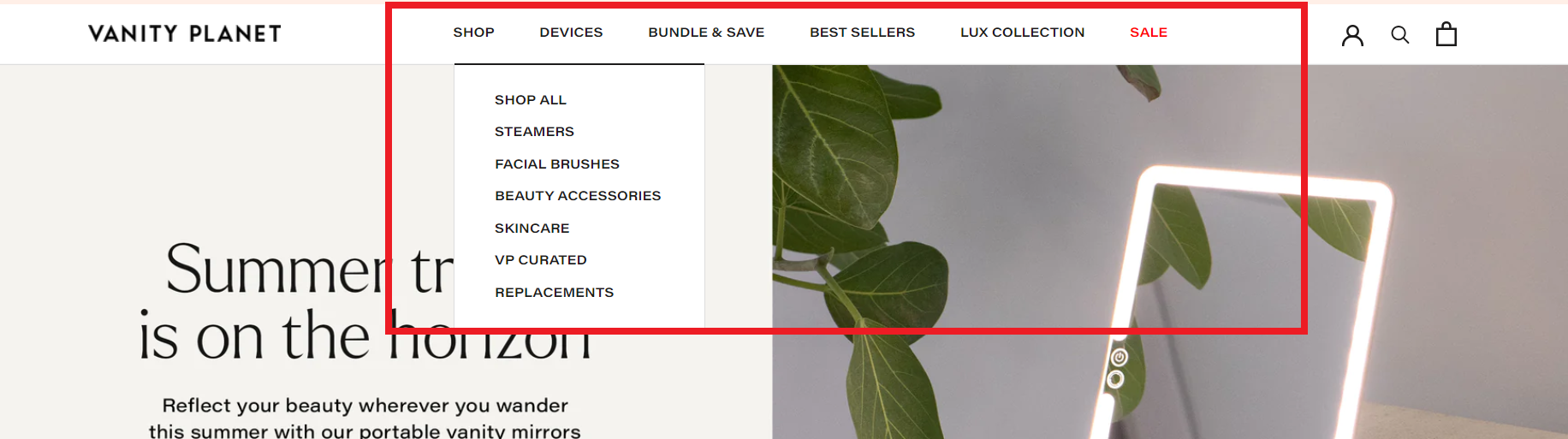
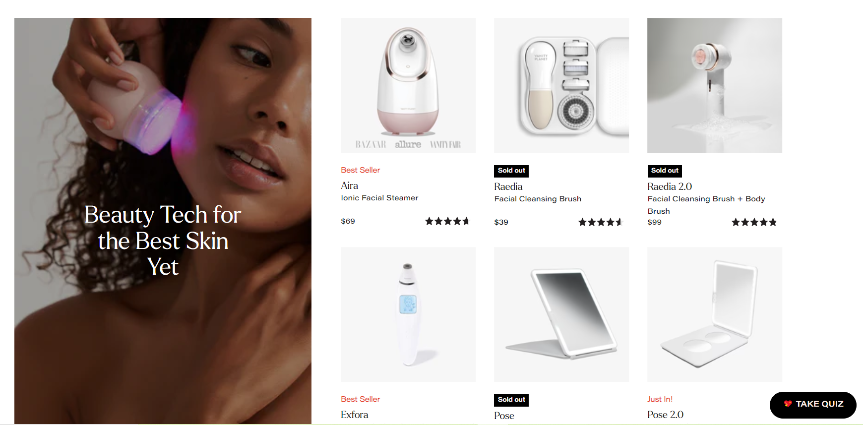
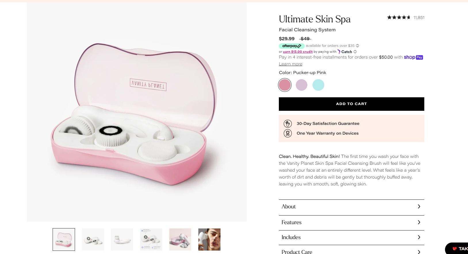
3. Vanity Planet
This ecommerce landing page is a good example of how landing pages can be used for selling specific items. Rather than focusing on all its products, the company decided to focus solely on one product.
So, let’s start with the design and navigation. Vanity Planet uses Slide Show Images as its website background.
What’s more, the heading is short and captures visitors’ interest in the first few seconds. Plus, the CTA button “Shop Now” is highly actionable and has a clear meaning.
Next, their fly-out menu is well-organized, and all the categories and sub-categories are clearly and well-defined.
Also, as you scroll down the home page, you can see that there’s a lot of information, and still it all looks neat and clean. Wondering why? Well, it’s because of the grid’s layout. It is asymmetrical, but still very organized.
Lastly, I love their product ecommerce page. It has high-quality photos, videos, product descriptions, customer reviews, a “how-to-use” section, FAQs, etc. In other words, it has it all!
👉 Check out the Top 15 Beauty Products For Dropshipping.
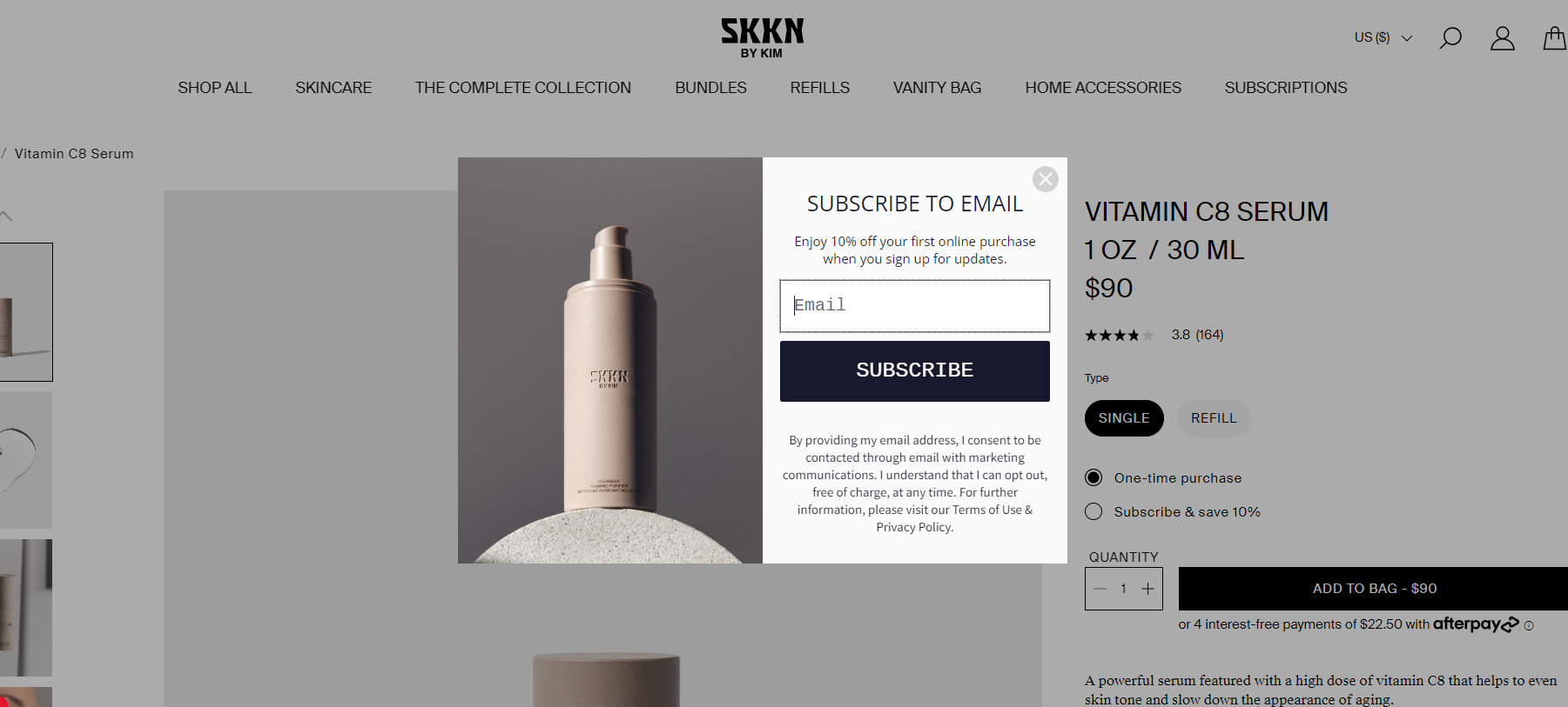
4. SKKN by Kim
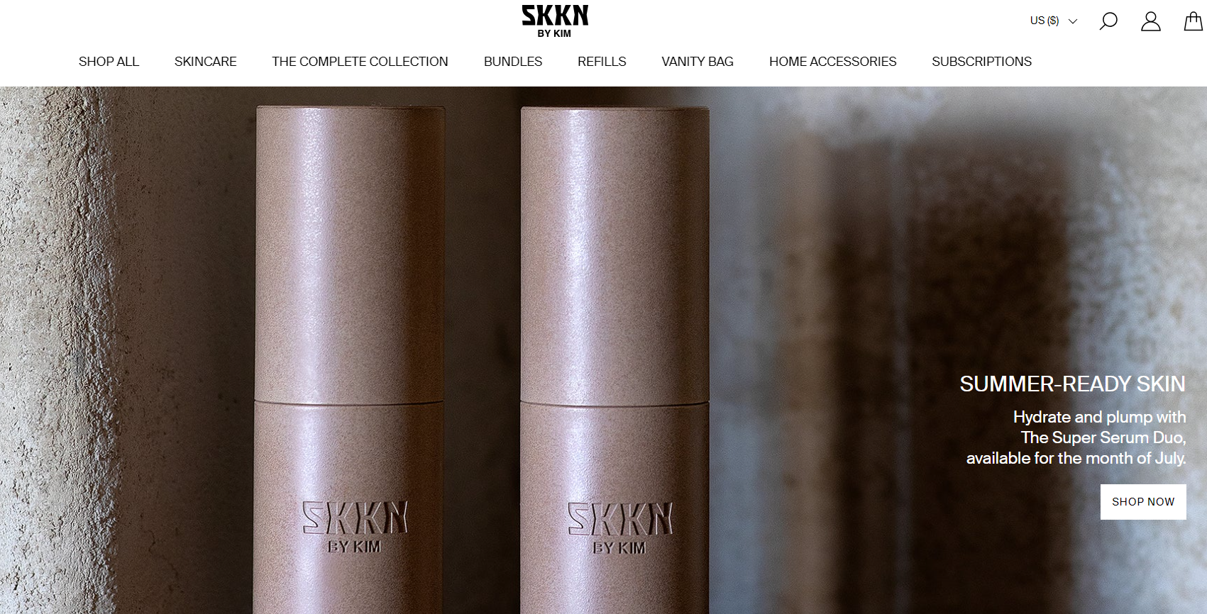
To begin, as one of the leading examples of a successful Shopify dropshipping store with stunning e-commerce landing pages, it is important to highlight the captivating full-screen photo layout upon entering the website. Additionally, the presence of a distinct call-to-action button (Shop Now) in a contrasting color grabs the attention of potential customers.
Moving forward, this dropshipping store effectively organizes its diverse content using a grid layout, and its footer is particularly noteworthy as it includes essential categories, sub-categories, and social proof.
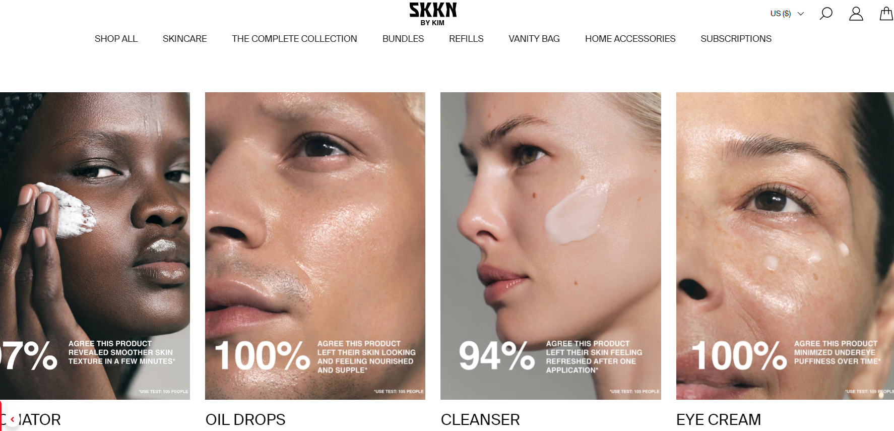
Furthermore, the product ecommerce landing page deserves a perfect score due to its comprehensive inclusion of necessary information for users.
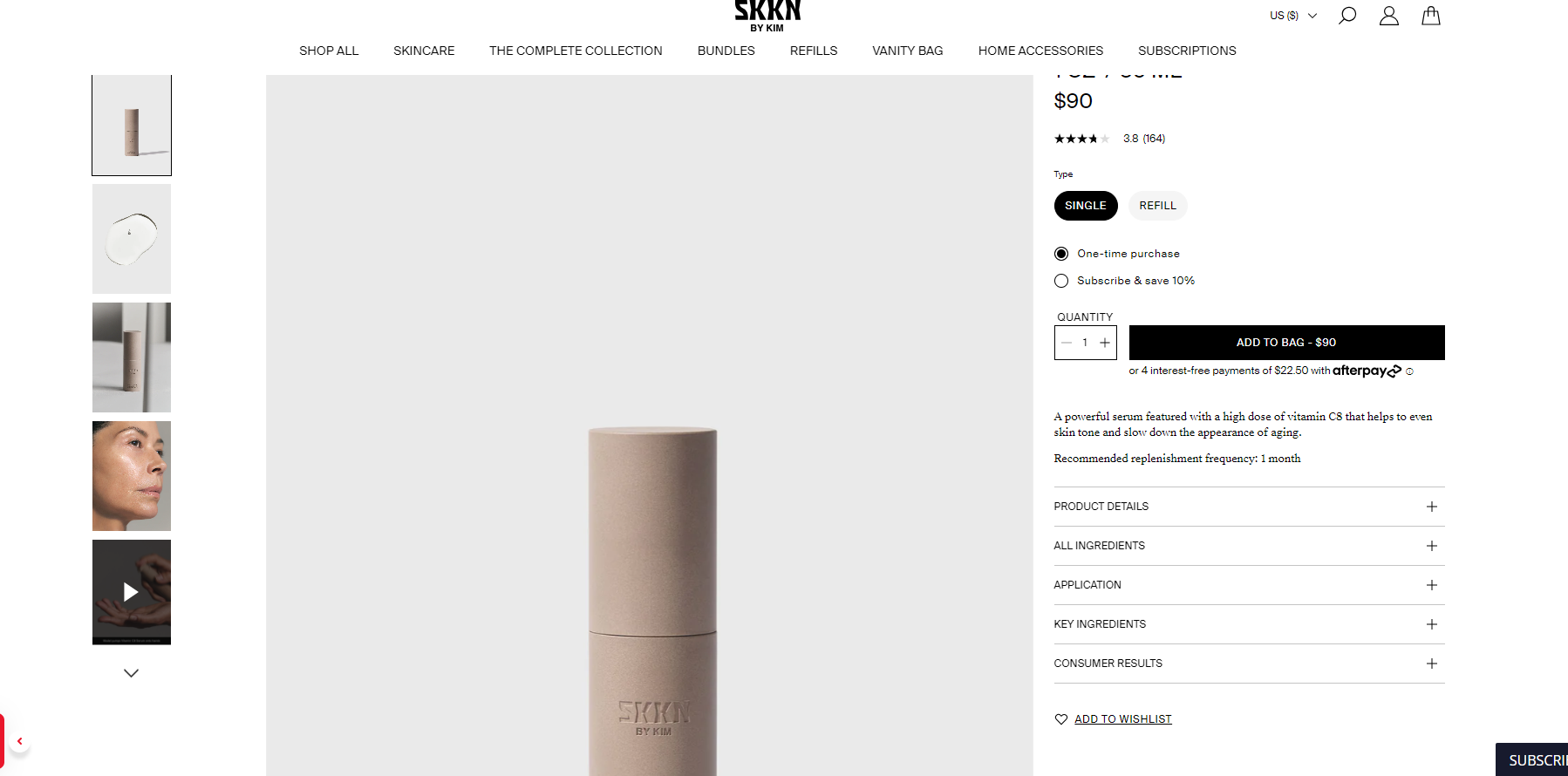
Therefore, I advise you to incorporate elements such as high-quality product images, detailed descriptions, color availability, prominent “buy now” and “add to cart” buttons, customer reviews, ingredient lists, and social sharing buttons.
SKKN by Kim employs a variety of marketing strategies and social proof, including the utilization of digital gift cards, product bundles, subscription options, informative tutorials, and a strong presence on popular social media platforms such as Facebook, Instagram, TikTok, Twitter, and YouTube.
Additionally, they maintain a newsletter to keep customers engaged and informed.
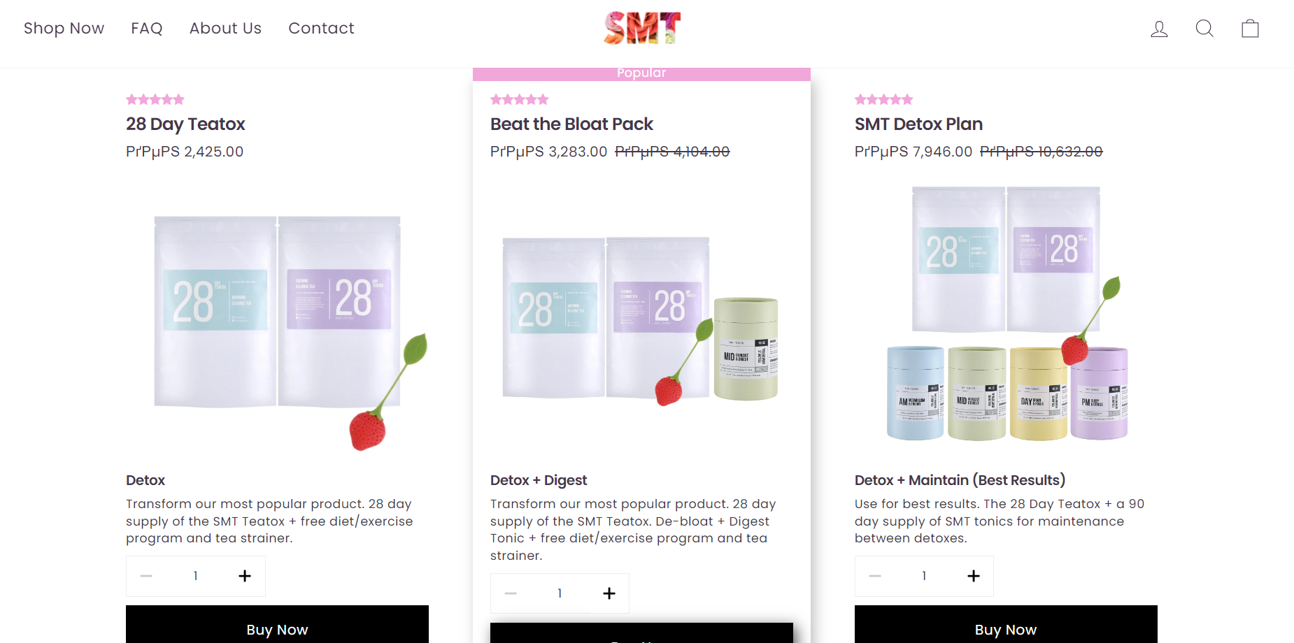
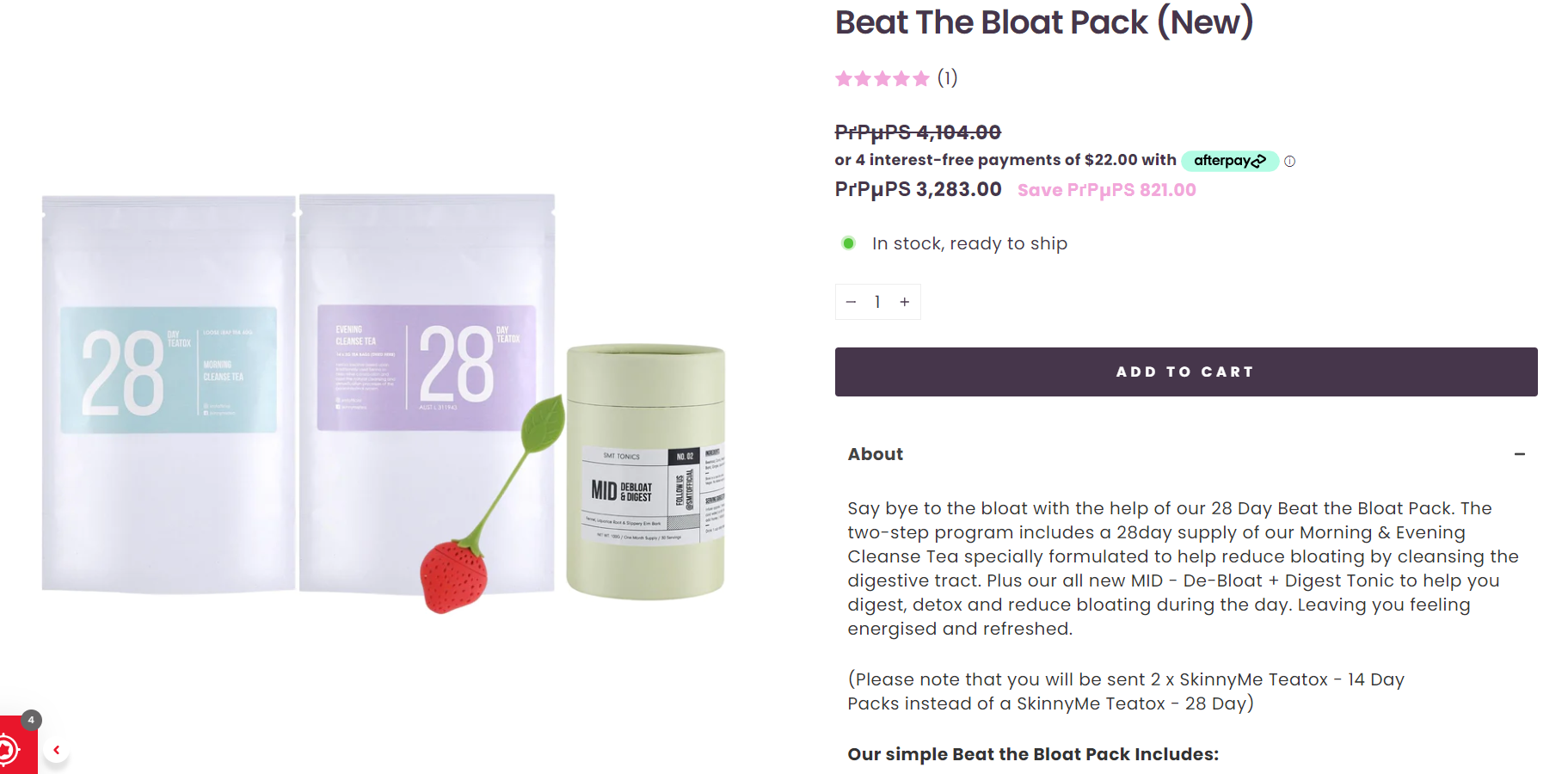
5. SkinnyMe Tea
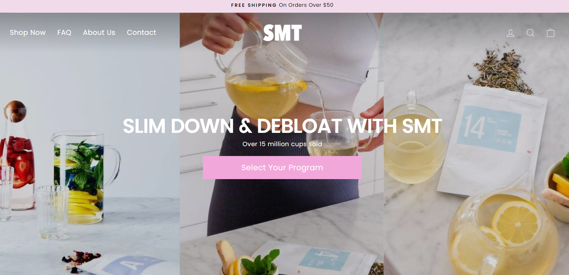
Beginning with an impressive pop-up (“Join the SMT Health Club”) that offers their customers to join their Newsletter, they really know their way of engaging them.
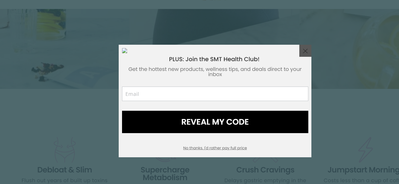
Upon a brief examination of their homepage, it is evident that they have effectively utilized a grid of card layouts to showcase all the essential information without causing any confusion.
The first element that catches our attention is the high-quality Full-Screen Photo background. Placed in the center is the call-to-action button, which has the potential to boost sales and profits! This clever strategy is highlighted by the use of contrasting colors against the background and typography (“Select your program”).
Additionally, this dropshipping store ensures smooth navigation as all the vital information is readily accessible on the homepage itself. The menu is a horizontal fly-out, featuring seven distinct main categories, adhering to the simple rule of having between five to seven primary categories.
The logo serves as a link leading back to the homepage, while at the upper right corner, you can find the search, log in/sign up buttons, shopping cart, and currency conversion options (EUR, AUD, INR, GBP, CAD, USD JPY).
Also, let’s dive deeper into the ecommerce landing page funnels. The product page has high-quality photos, product descriptions, call-to-action buttons (Add-to-cart), a “you may also like” section, customer reviews, etc. In other words, all that one needs to include for having a high-converting page.
👉 Check out the Top 11 Best Health and Beauty Dropshipping Suppliers & Trending Products.
6. Notebook Therapy
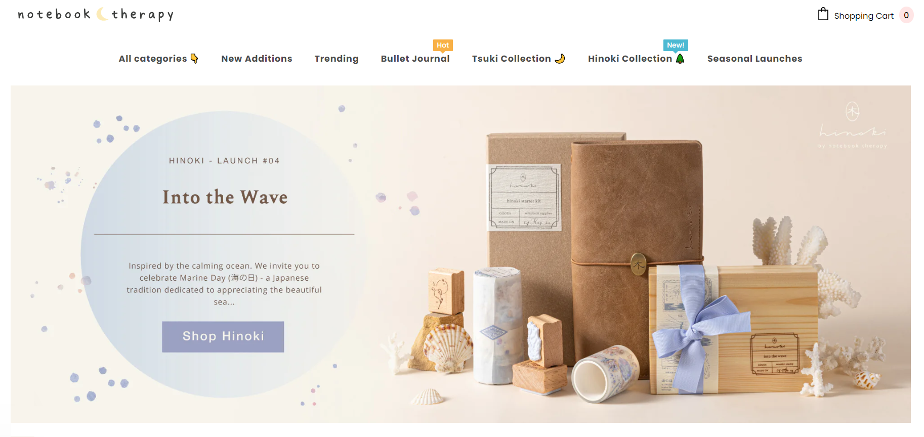
First thing first, I must say that their layout is so dreamy and sweet, and it describes their dropshipping brand perfectly!
Upon arriving at their website, you’ll be greeted with an enticing pop-up that offers a generous $50 discount gift card. Thus, this clever marketing strategy is highly effective for your business.
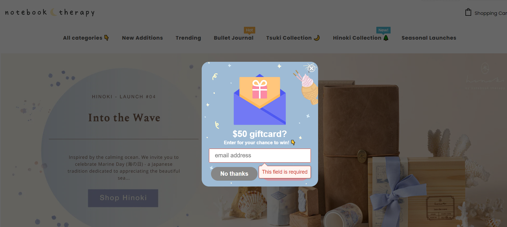
Additionally, let’s discuss the store’s design. This Shopify store uses a captivating full-screen photo layout and strategically places all the necessary call-to-action buttons in just the right spots!
For instance, they do content revolving around a specific product, or their new product arrival (“Shop Hinoki”).
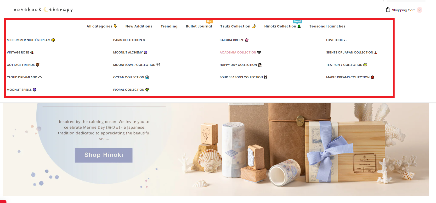
Moreover, the website boasts a well-organized and user-friendly horizontal fly-out navigation menu, featuring four easily comprehensible categories.
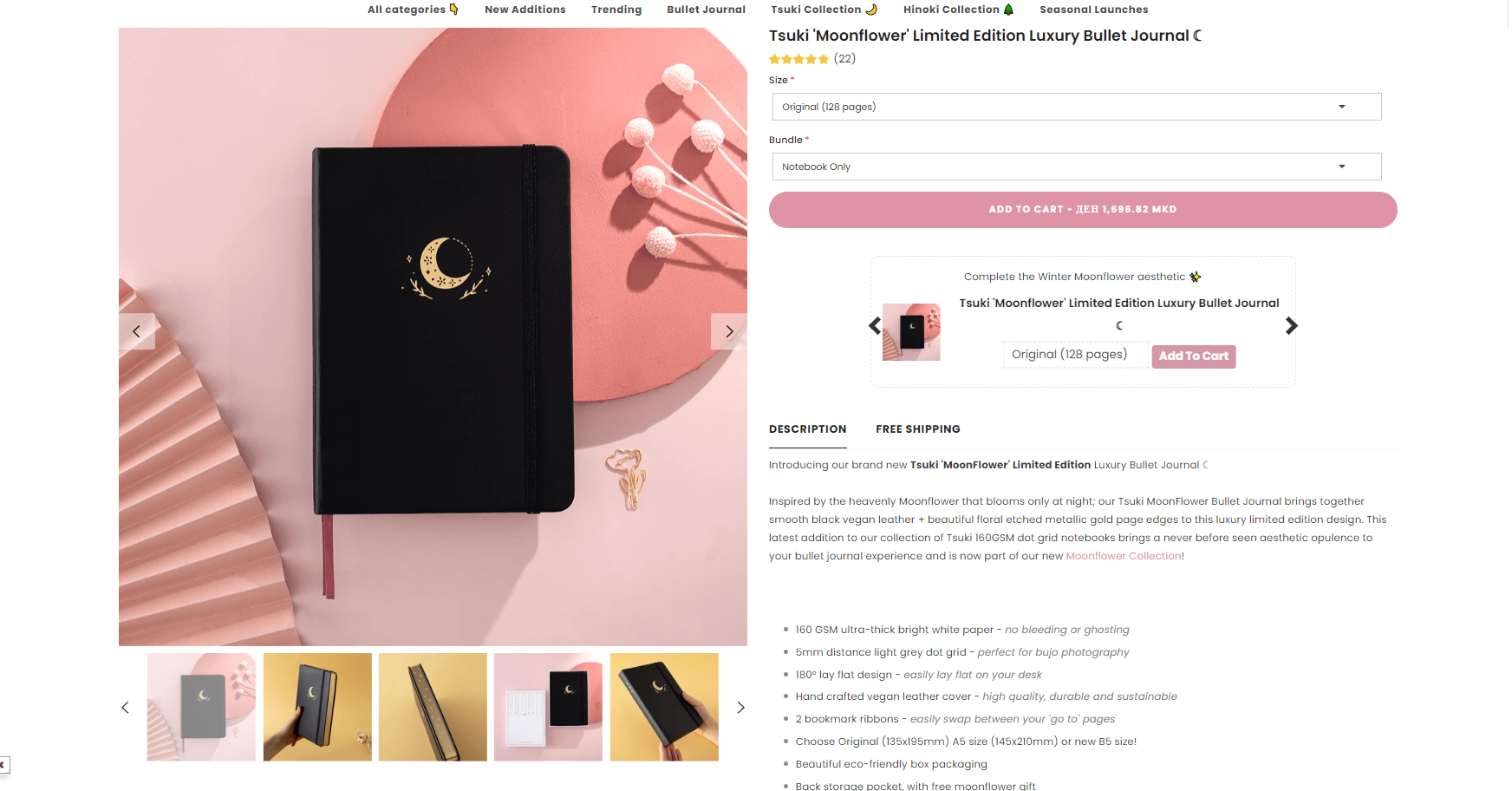
Furthermore, if you’re seeking an ideal product ecommerce landing page, this store has it all, from comprehensive product descriptions to high-quality imagery and all the essential call-to-action buttons.
Furthermore, Notebook Therapy showcases social proof by displaying Trustpilot customer reviews, social media buttons (Facebook, Instagram, Pinterest), a newsletter sign-up option, etc. These tactics are highly effective for engaging customers.
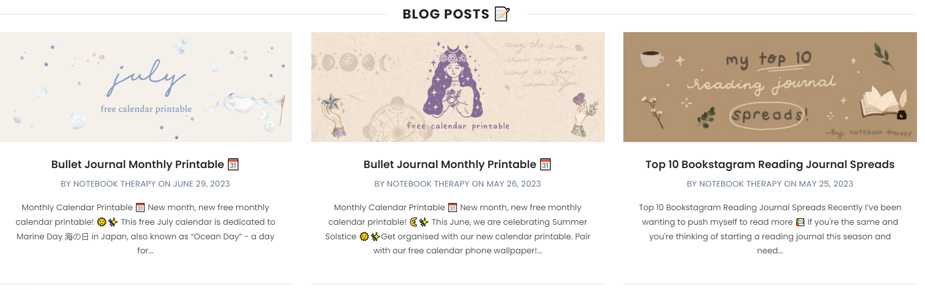
Additionally, they have a blog, which serves as another valuable tool for increasing website conversions.
👉 Check out the 15 Best Shopify Blog Examples To Double Your Organic Traffic.
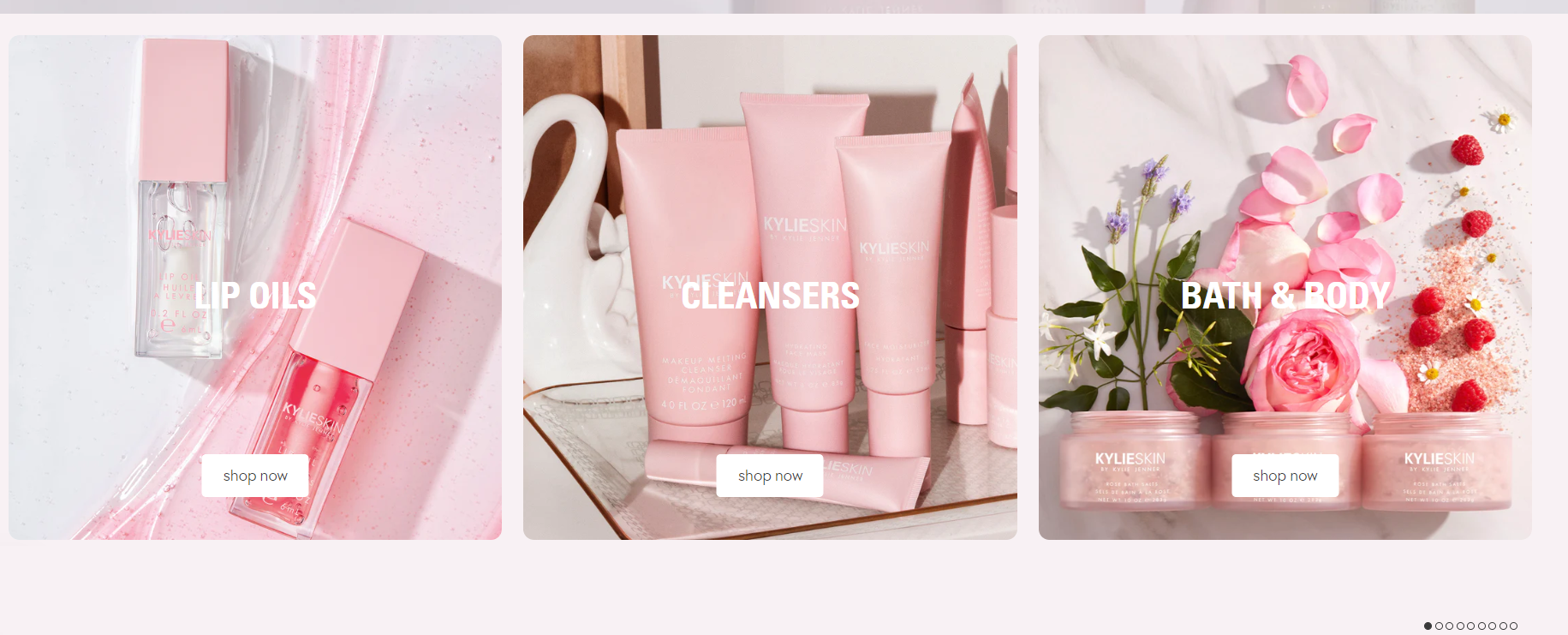
7. Kylie Cosmetics
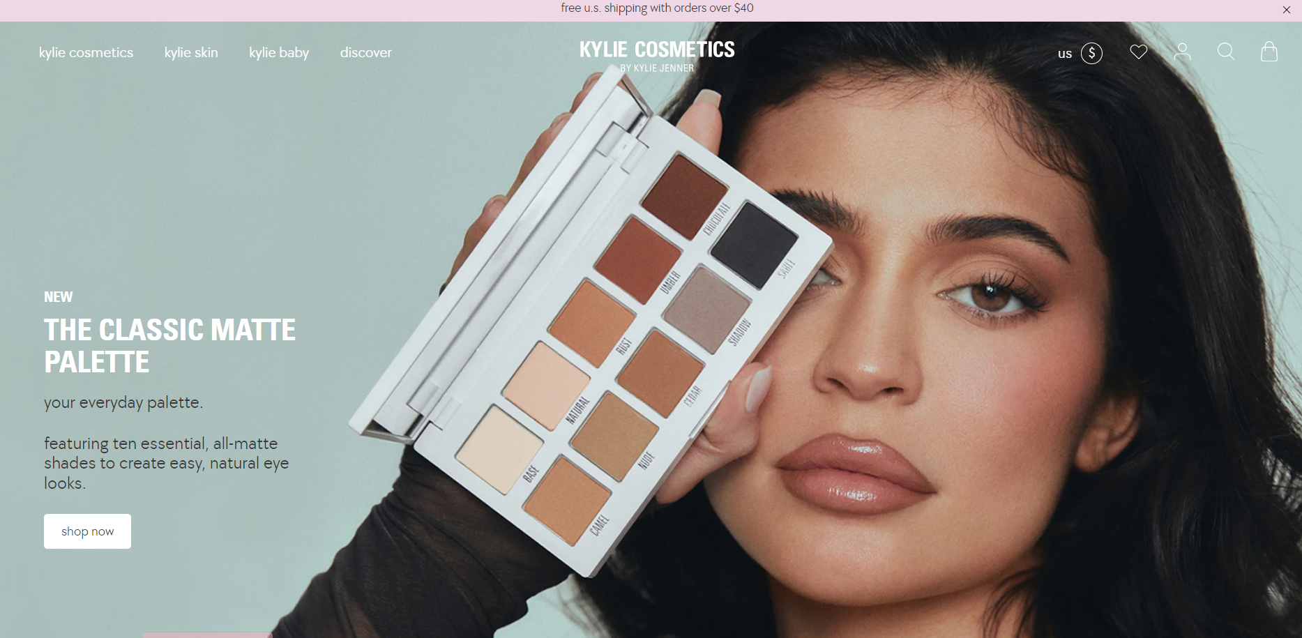
You would probably think now – “It’s Kylie Jenner people, she must have spent dozens of money to have this good looking ecommerce landing page”. Well, no! It is actually a Shopify store.
Now, let’s have a quick review of its ecommerce landing pages.
On the main homepage, you can find all the essential components that contribute to easy navigation, arranged in a Z-pattern.
Firstly, the logo acts as a clickable link that directs customers to the homepage. Moving towards the right corner, you will find options for searching, logging in, or signing up, accessing the shopping cart, and changing currency.
The homepage features a full-screen image, a grid layout of cards, colorized call-to-action buttons like “Shop now,” and a pleasing pastel color scheme, all of which create an impression of professionalism associated with the brand. Throughout the website, high-quality images are utilized extensively.
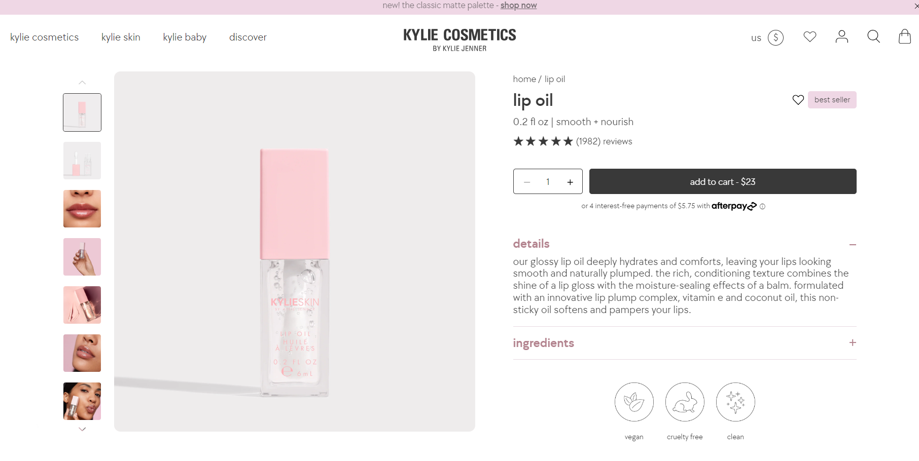
The product ecommerce landing page provides users with a wealth of additional information that adds value, including multiple product photos, customer reviews, and the option to share products on social media platforms.
Kylie Cosmetics enhances customer satisfaction by offering value-added content on the homepage, such as details about free shipping, discounts, assistance through FAQs, information about their values, and more.
8. NCLA beauty
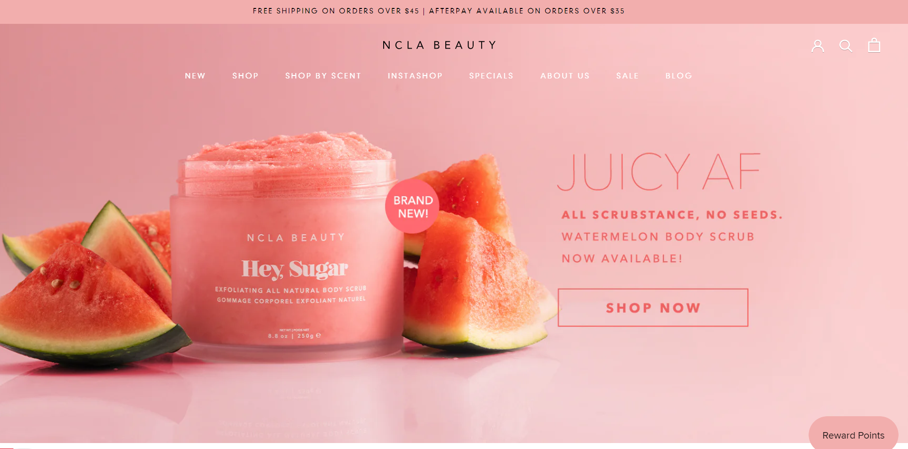
The web design layout of NCLA Beauty is absolutely stunning! From the vibrant colors to the captivating photos and overall arrangement, it is truly impressive.
Firstly, the fresh and lively summer colors immediately grab the attention of users. The high-quality full-screen photo layout on the homepage is perfectly executed, giving it a clean, delightful, and refreshing appearance. Plus, their newsletter subscription popup is also a great marketing tactic.
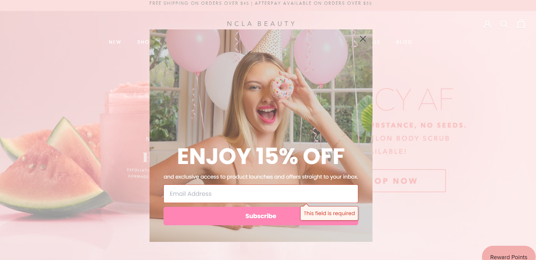
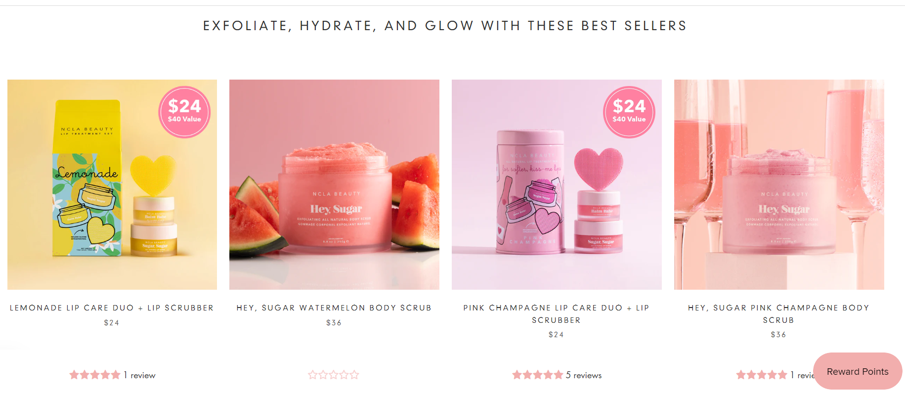
This dropshipping store offers a wealth of information on the homepage, primarily focusing on products, but also including links to blog articles, their Instagram account, and more. However, all this information is skillfully organized using a grid of card layouts, ensuring a well-structured and visually appealing presentation.
Furthermore, all other essential navigation elements such as the logo, navigational menu, login/sign-up, shopping cart, and search buttons are prominently displayed and easily accessible from the homepage.
The product ecommerce landing page is equally fantastic, providing all the necessary information for users.
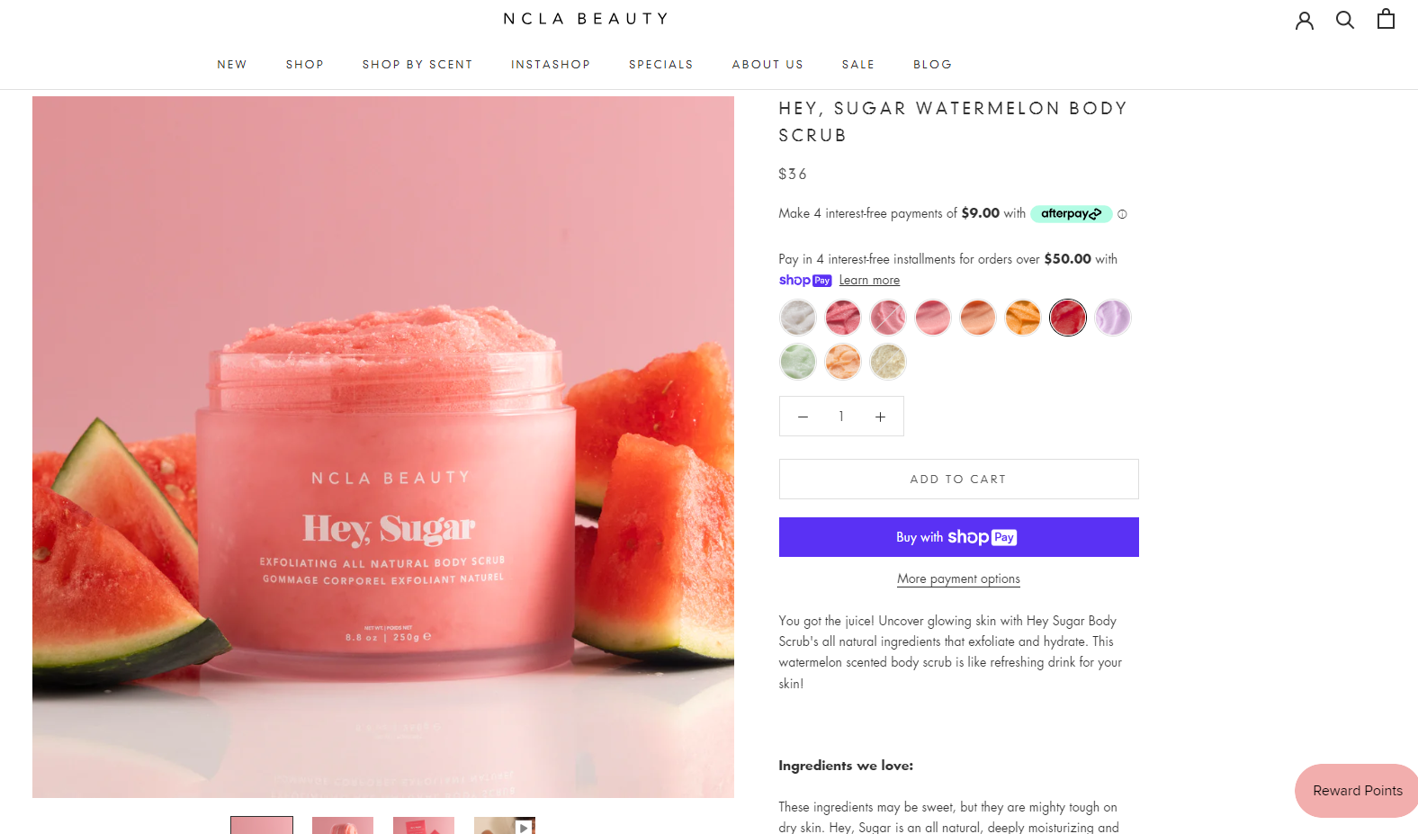
Also, I highly recommend you incorporate elements like high-quality product photos, detailed product descriptions, customer reviews, ingredient lists, and social sharing buttons.
Furthermore, the footer of the website includes links to various categories related to social proof, as well as links to their social media presence, newsletter subscription, payment methods, etc.
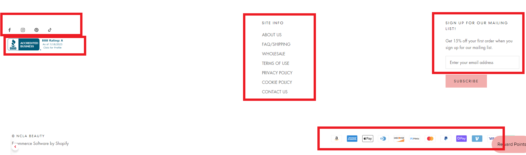
However, I advise you to consider adding links to your product categories in the footer as well, making it serve as a comprehensive sitemap for easy navigation.
👉 Also, check out the 50 Biggest Shopify Stores to Inspire Every Dropshipper.
Conclusion
To summarize, your ecommerce landing page should persuade your visitors to act on an offer. In essence, there are different landing pages for different marketing campaigns.
So, you need to synchronize your landing page with your marketing campaign.
Just follow our tips and you will build a landing page that converts! Also, I hope that our examples of high-converting landing pages can stimulate your creativity and spark your imagination.
Want to learn more?
How To Find The Best Dropshipping Niche for Your Business in 2021;
Best E-commerce Platforms In 2024: How To Choose One For Your Store?
Debutify Shopify Theme Review: Is Debutify The Right Theme for Dropshipping?
How To Set Up Your First Store On Shopify [No.1 Beginners Guide].


![The Top 21 3PL Companies Compared [2024 List & Guide]](https://images.weserv.nl/?url=https://prod-dropshipping-s3.s3.fr-par.scw.cloud/2024/03/Frame-3922469.jpg&w=420&q=90&output=webp)