19 Best Strategies To Improve Your Product Page Optimization
I'm looking for...
Are your product pages failing to convert browsers into buyers? Wondering what it takes to master product page optimization?
Dive into my comprehensive guide to uncover the secrets behind successful eCommerce. From enhancing user experience to boosting conversions, this article will equip you with actionable strategies and real-world examples to transform your product pages.
Ready to unlock the full potential of your online store? Let’s get started!
Create Your Online Store in just 5 Minutes – For Free
Pick your niche, our AI builds your store, add 10 winning products and we teach you how start selling today. Start picking your niche
What Is A Product Page Optimization?
Product page optimization involves tweaking and refining various elements on your product pages to improve user experience, increase engagement, and boost conversions.
This process includes optimizing images, descriptions, titles, and even the layout to ensure that every aspect of the page works together to highlight the product’s best features and make purchasing irresistible.
Think of your product page as a storefront window. People will pass by without a second glance if the display is messy or uninviting. But if it’s eye-catching and well-organized, they’ll be drawn in and eager to learn more.
Product page optimization is all about making that display as enticing and efficient as possible to convert casual browsers into loyal customers.
Imagine reading a book with no pictures. It’s all text, with no visuals to engage your imagination. Now think about flipping through a beautifully illustrated graphic novel. That’s the difference high-quality images and videos can make on your product page.
Now, I think you get my point about why you really need product page optimization. So, let’s learn how to optimize.
How To Optimize Your Product Pages? 19 Top Strategies
Here I will guide you through how to optimize your product pages. Hence, these 19 product page optimization strategies really work for me.
But, remember! You need to do it right. So, catch up with me, and use my tips and tricks!
1. Improve Your Page Layout
Improving your page layout is key for a user-friendly and appealing product page. Keep it simple and clear with white space and avoid clutter.
So, start with high-quality images or videos at the top, followed by the product name and price. Ensure important details like descriptions, features, and benefits are easy to find with clear headings. Highlight CTA buttons with contrasting colors and place them prominently.
Also, use navigation aids like breadcrumbs and maintain a consistent look with the same fonts and colors across all pages. Test your layout on different devices to ensure responsiveness.
For example, Shopify has numerous themes that offer amazing product page layouts. For instance, the Debutify theme is simple and elegant, perfect for showcasing products with large images and clear, easy-to-read descriptions.
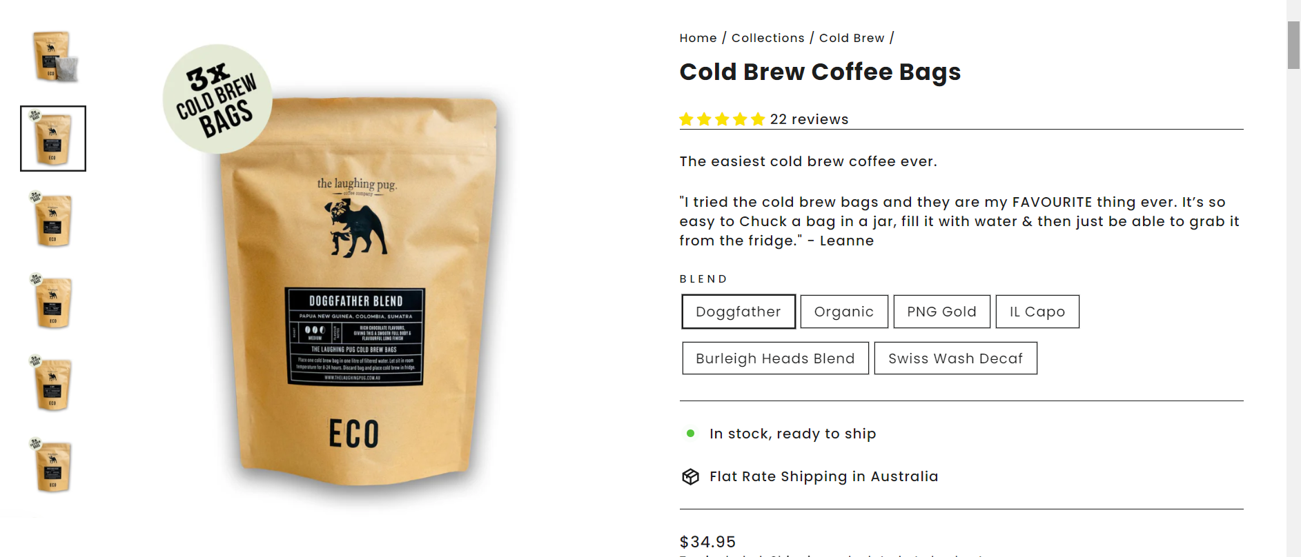
It includes customizable content sections on the homepage and a clean, intuitive layout on product pages.
On the other hand, the Brooklyn theme features a stylish grid layout and beautiful product pages that highlight images and descriptions effectively.

2. Write Informative Product Descriptions
When it comes to product page optimization, writing informative product descriptions is a MUST.
So, think about how you’d describe the product to a friend. You want to be clear, engaging, and thorough. Describe what the product does, how it benefits the user, and why it’s better than the competition.
Also, use simple language and highlight key features that make your product stand out.
For instance, if you’re selling a handcrafted leather wallet, mention the type of leather, the craftsmanship, and the unique design elements.
The goal is to answer any questions a potential buyer might have before they even ask.
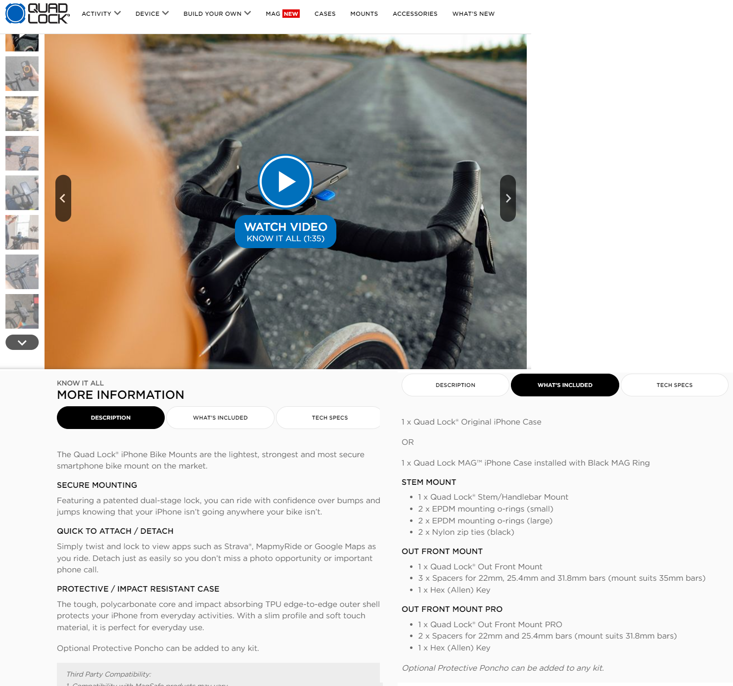
For example, I always find inspiring Quadlock product descriptions. They explain each product detail, features, material, size, and all.
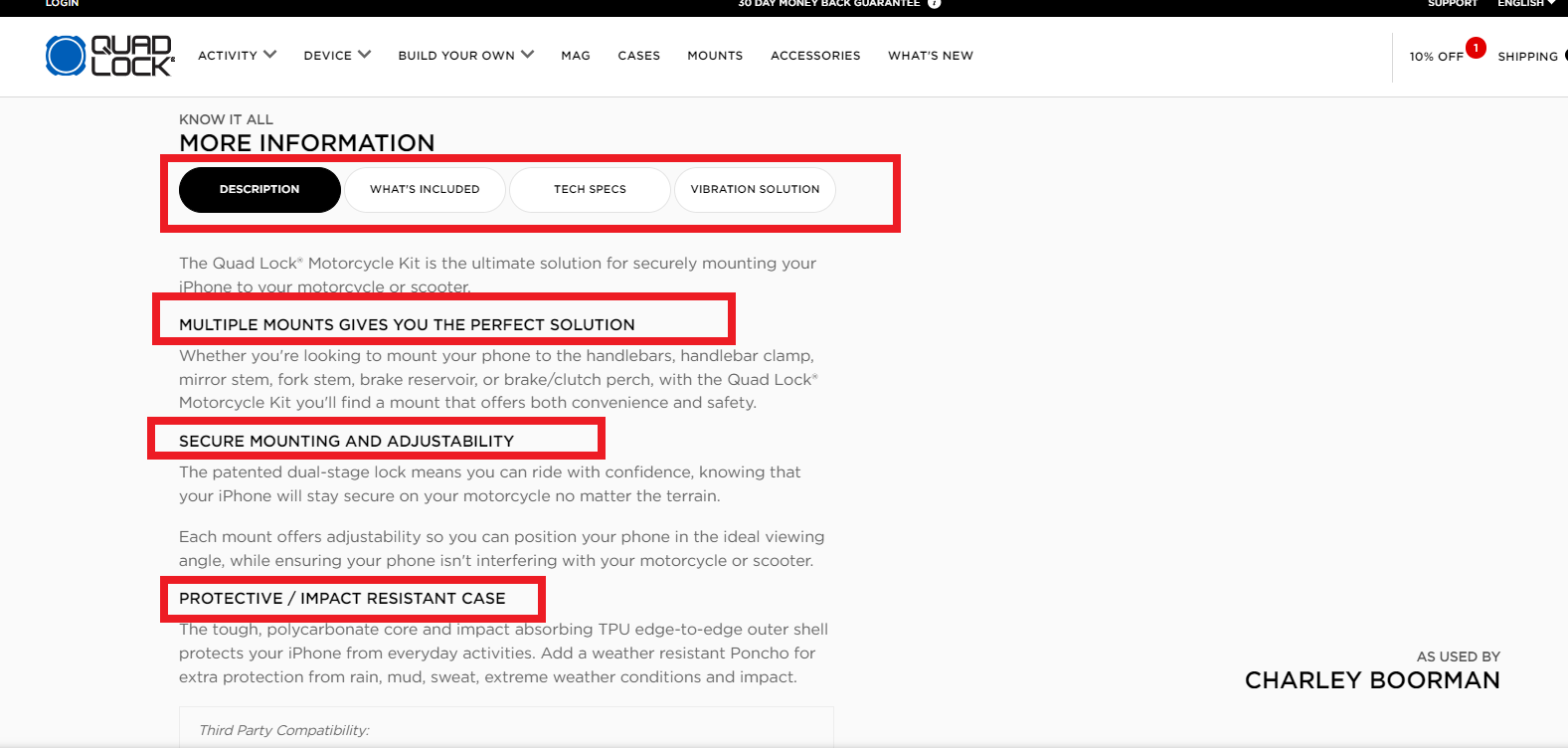
Plus, they organize the data into multiple headings and different sections like what’s included, tech specs, and more.
3. Use High-Quality Images
Using high-quality images is essential for product page optimization because they are one of the most attractive features of a website. So, instead of filling your page with long, boring text, let the photos do the talking.
Plus, images speak a thousand words and can significantly boost your conversion rates.
So, what kind of images should you use? Use images that clearly define your product. Avoid basic or low-quality photos.
Always opt for the highest quality. Show your product in different settings to make it more relatable and engaging.
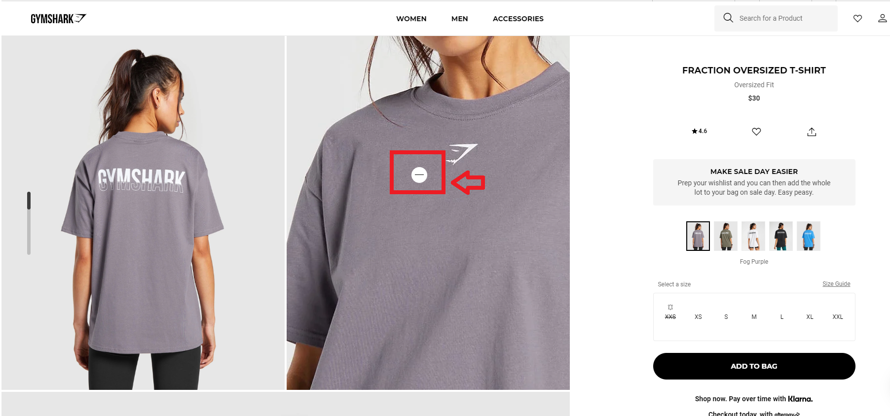
For example, GymShark uses high-quality images that beautifully showcase their products in use. And the models, wow! Plus, you can zoom in as much as you like onto the photo, and check on each detail, there won’t be any blur.
4. Include Social Proof
Including social proof is like having your customers vouch for you. This can be reviews, ratings, testimonials, or even photos of customers using your product.
People trust other people’s experiences, so make sure to showcase these on your product page.
For example, if you have a review stating, “This t-shirt is the best I’ve ever owned – durable, stylish, and practical,” it can significantly boost trust and convince others to buy.
For instance, Vanity Planet not only posts customer testimonials, but it also gives customers the option to filter the results based on rating and keyword and sort them from lowest to highest rating.
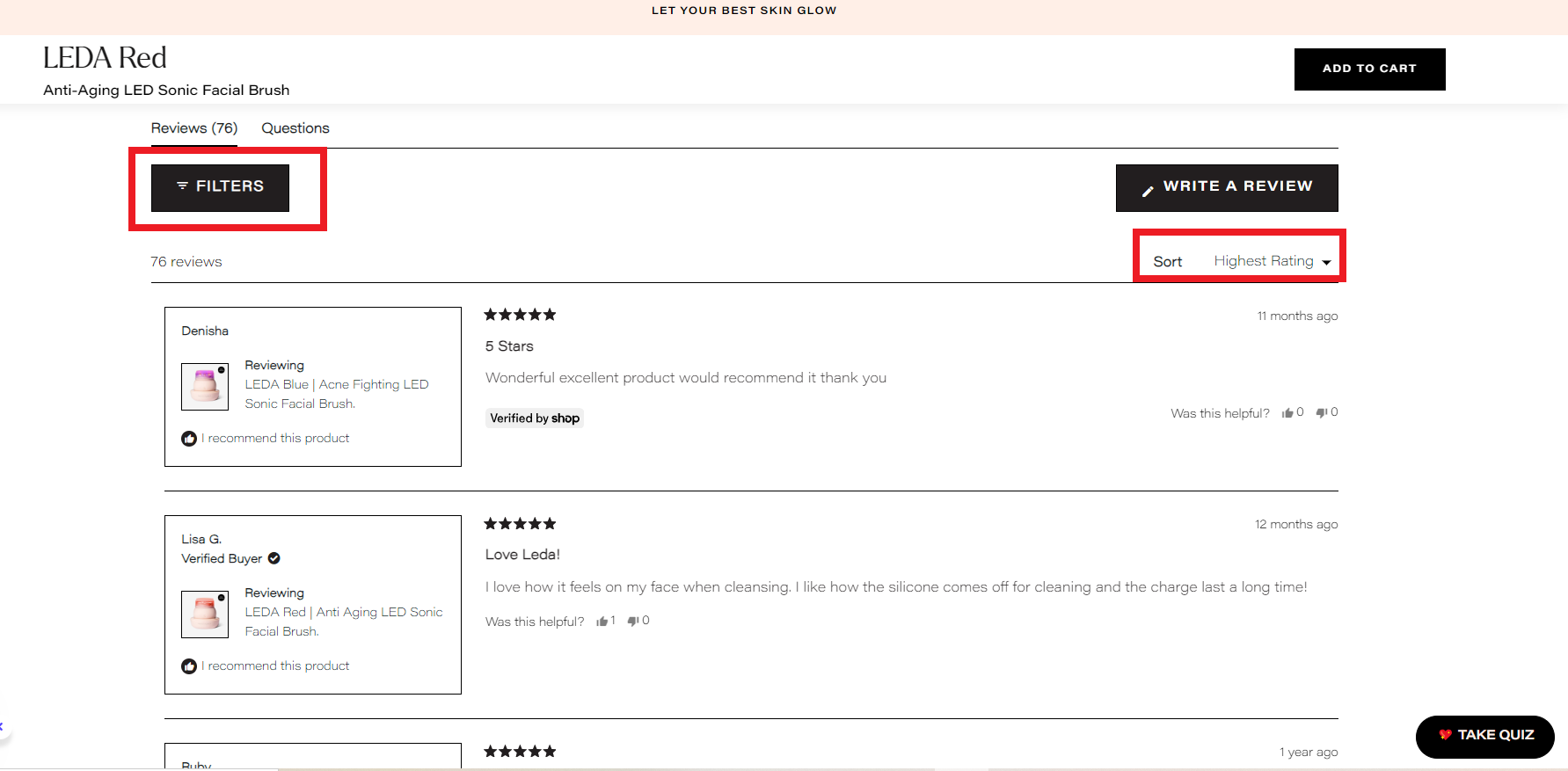
Plus, for me Skinnyme Tea product reviews are great insporation as well. They let users share photos and give opinion.
Also, adding social media links to your product pages can greatly enhance social proof. Link to your product’s positive mentions on platforms like Instagram, Facebook, and TikTok.
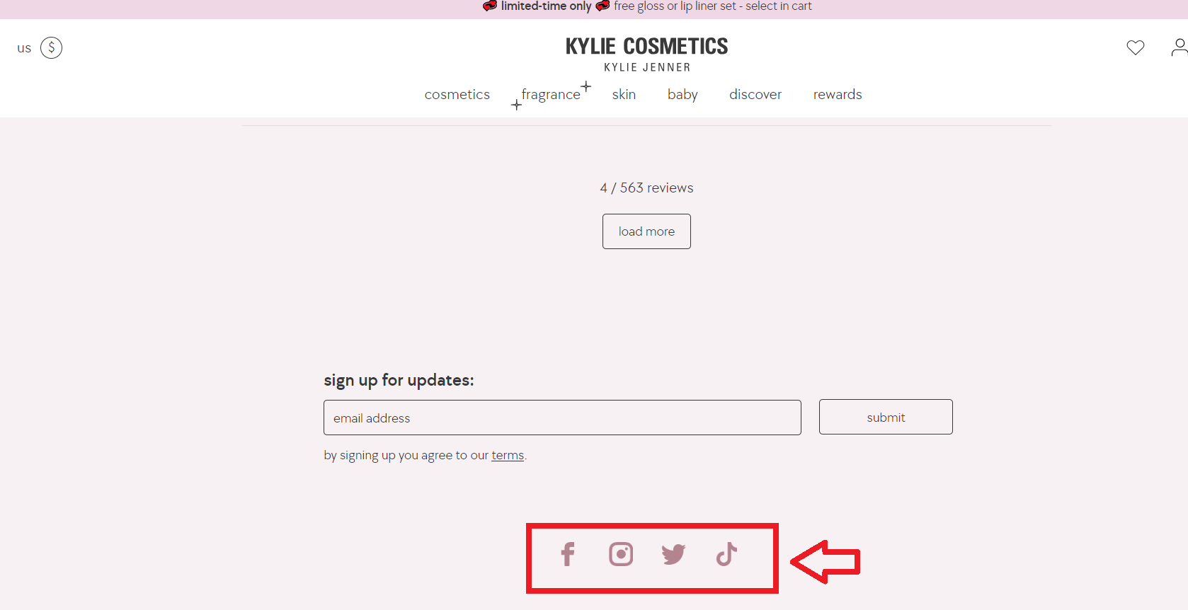
This shows that real people are talking about and enjoying your product.
Encourage customers to share their purchases on social media and feature these posts on your product pages.
Plus, allow customers to share your product page directly from your site. Adding share buttons makes it easy for them to spread the word, increasing your product’s visibility and credibility.
5. Include Breadcrumbs
Breadcrumbs are those little navigation aids that help users understand where they are on your site. So, including breadcrumbs on your product pages can greatly improve the user experience and improve your product page optimization.
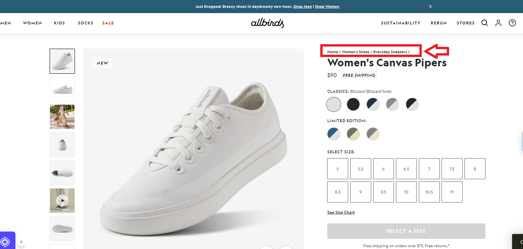
So, if you have a large menu with lots of categories or sub-categories, adding it might be helpful for navigation.
They allow customers to easily navigate back to previous categories or sections, reducing frustration and making it simpler to browse your site. Think of it as a roadmap that keeps them from getting lost.
6. Make it Mobile-Responsive
In today’s world, most people shop on their phones. Making your product pages mobile-responsive ensures that your site looks great and functions well on all devices.
This means your images should load quickly, text should be readable without zooming in, and buttons should be easy to tap. If your site isn’t mobile-friendly, you could be losing a lot of potential sales.
For example, check out the Zara product page on the desktop.
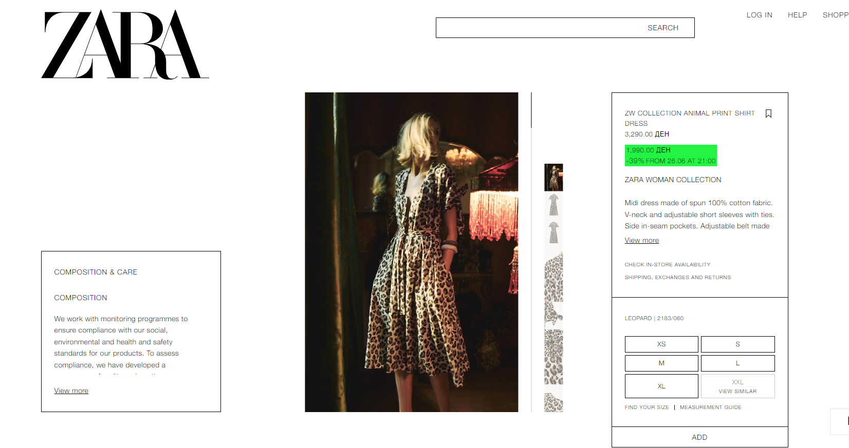
Also, here’s the Zara product page on my mobile app. All elements are perfectly aligned and easy to navigate.
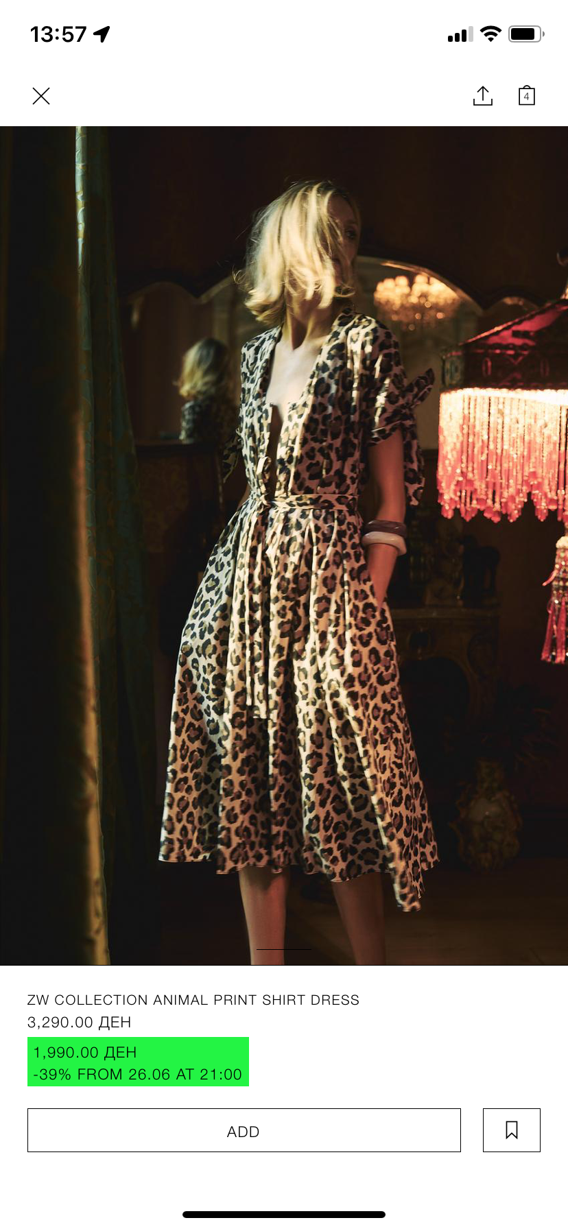
7. Use The Upselling & Cross-Selling Strategies
Using upselling and cross-selling strategies can boost your sales and improve product page optimization by offering customers related products or upgraded versions of what they’re already considering.
For example, if someone is looking at a leather wallet, you could suggest a matching belt or a higher-end wallet with additional features.
This not only increases your sales but also enhances the shopping experience by providing more options that your customers might love.
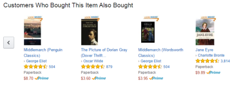
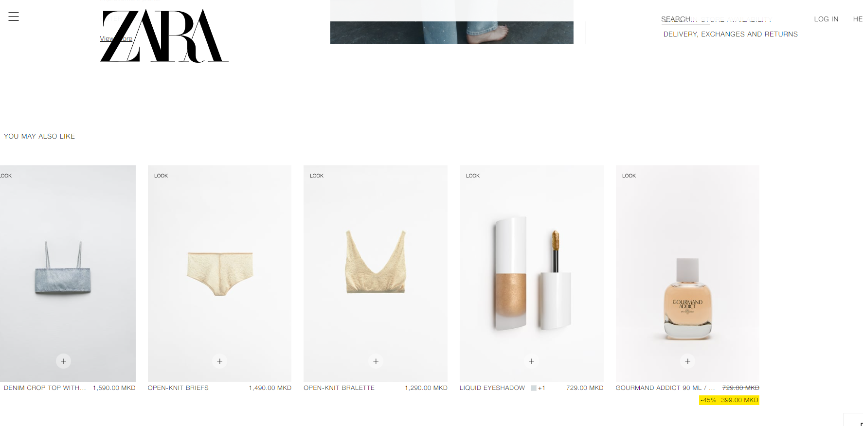
You can add product recommendations in sections like “You may also like,” “Customers who bought this also bought,” or “You might be interested in.”
For instance, Amazon boosts its sales with a “Customers who bought this item also bought” section on every product page.
Similarly, Zara includes a “You may also like” section on every product page.
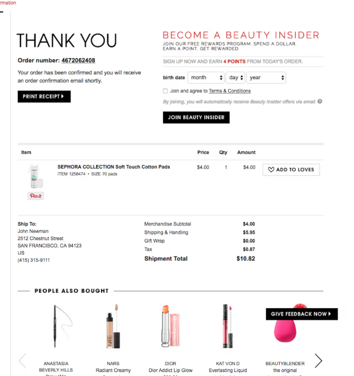
Additionally, you can use this strategy in personalized confirmation emails. Sephora, for example, sends personalized emails with purchase details and a “People also bought” section.
8. Use Videos To Showcase Your Products
Using videos to showcase your products is a fantastic way to give customers a better understanding of what they’re buying.
A video can demonstrate how the product works, show it from multiple angles, and highlight key features.
For instance, a short video showing the different compartments of your leather wallet and how it fits into a pocket can be much more effective than photos alone.
Hence, this is what I love about Quadlock. Each of their product pages consists of several videos about the product showcasing its material, how-to-use instructions, features, and more.
9. Include A Few Clear CTA Buttons
Don’t forget to include a few clear CTA (Call-to-Action) buttons on your product pages. You want to boost your product page optimization, right?
Well, this way you can increase your conversion rates when customers click on a button that redirects them to another page of your store.
These buttons should stand out and guide users on what to do next, whether it’s “Add to Cart,” “Buy Now,” or “Check Availability.”
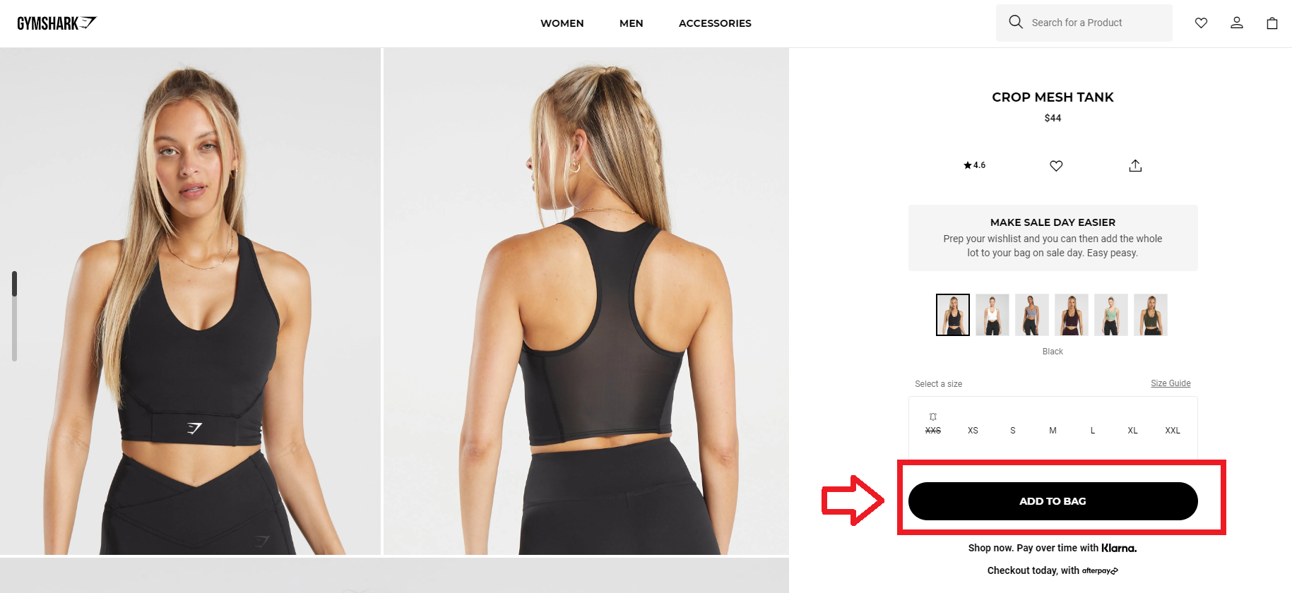
Make sure they are easy to find and click, whether on a desktop or a mobile device. Clear CTAs can help reduce any hesitation and encourage your visitors to complete their purchase.
10. Product Page Search Engine Optimization (SEO)
Optimizing your product page for search engines is crucial for attracting organic traffic and increasing sales. So, you need to identify and use relevant keywords in your product titles, descriptions, and meta tags.
Thus, tools like Google Keyword Planner can help you find the right keywords.
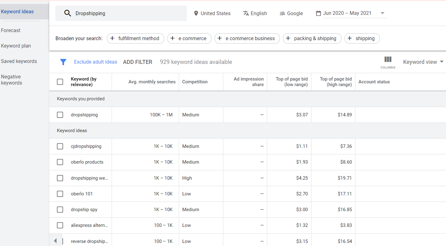
For example, if you’re selling handcrafted leather wallets, use keywords like “handcrafted leather wallet,” “high-quality leather wallet,” or “durable leather wallet.”
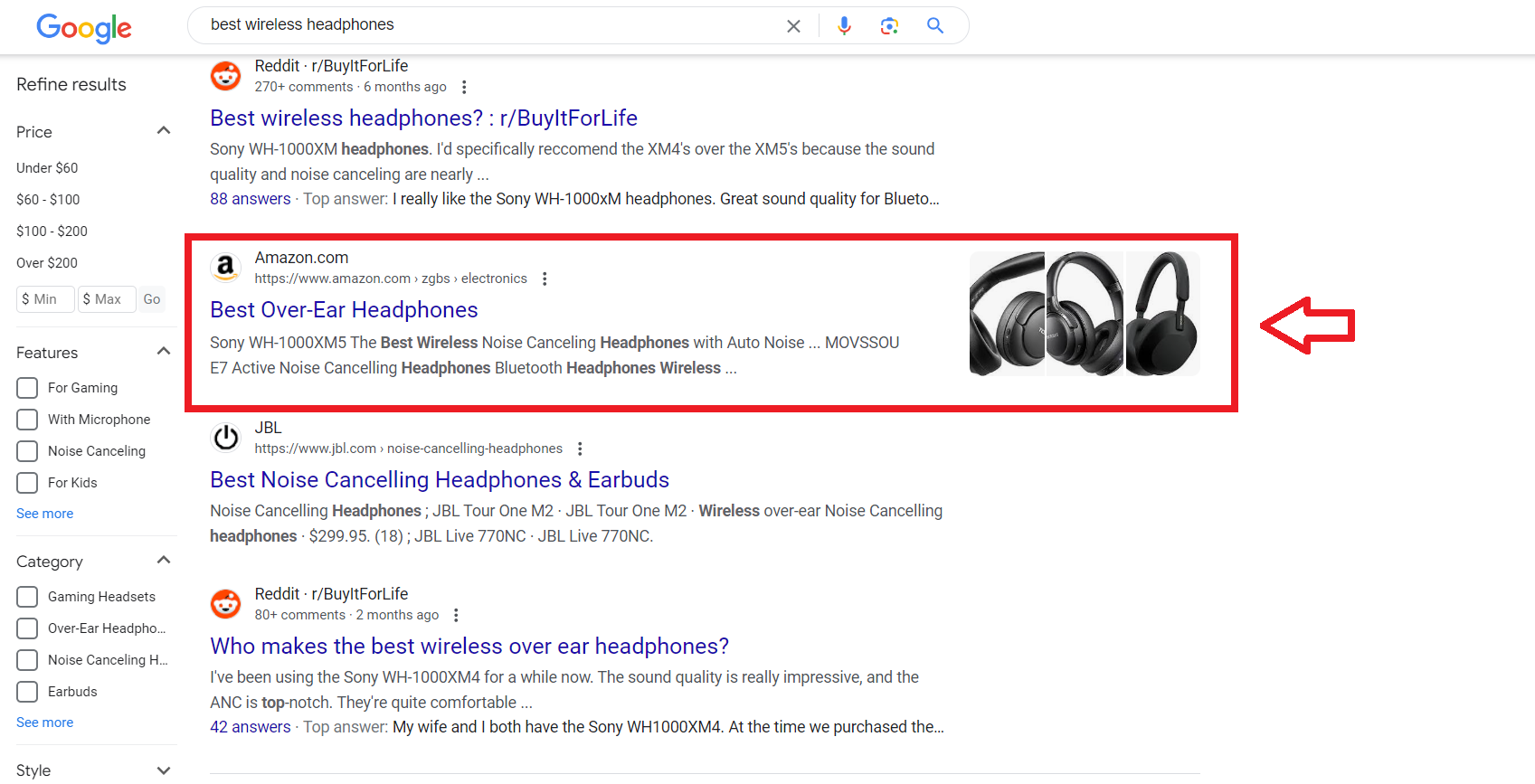
For example, Amazon demonstrates exceptional SEO in practice. When users search for products such as “best wireless headphones,” Amazon’s product pages frequently rank at the top of the search results.

This prominent positioning attracts a significant amount of traffic to their site, ultimately boosting sales.
Moreover, avoid using manufacturer descriptions or duplicate content.
Write unique, informative product descriptions that include your target keywords naturally. This not only helps with SEO but also provides valuable information to your customers.
Not only that but, I advise you to optimize your product images by using descriptive file names and adding alt text that includes relevant keywords.
This helps search engines understand what the images are about, improving your chances of appearing in image search results.
For example, instead of naming your file “IMG1234.jpg,” name it “handcrafted-leather-wallet.jpg.” This really helps you improve your product page optimization and rank higher on Google search results.
Also, your meta title and description are what potential customers see in search results.
Make sure they are engaging and include your target keywords.
For example, “Handcrafted Leather Wallet – Durable & Stylish | YourBrand” for the title and “Discover our premium handcrafted leather wallets, made from top-quality Italian leather. Shop now for durability and timeless style.” for the description.
Allbirds effectively use SEO by incorporating keywords like “sustainable shoes” and “eco-friendly footwear” in their product titles, descriptions, and meta tags.
I personally use AlphaRank, a user-friendly, AI-powered SEO tool specifically designed for Shopify stores. It streamlines my SEO efforts with automatic diagnostics and fixes.
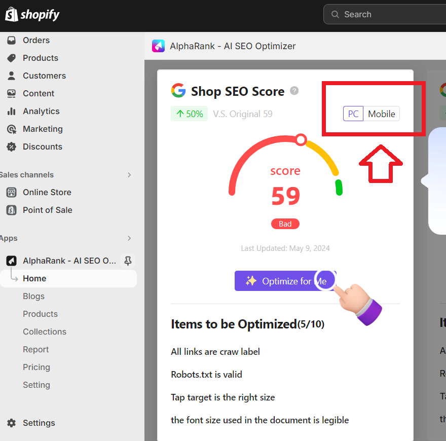
For example, AlphaRank helps me enhance both the technical and content aspects of SEO by improving meta tags, alt text, and structured data.
Additionally, with features such as keyword insights, AI-generated content, and SEO score enhancements, AlphaRank simplifies SEO management. This makes it an indispensable tool for boosting online visibility and driving traffic to your Shopify store.
11. Include Product Bundles
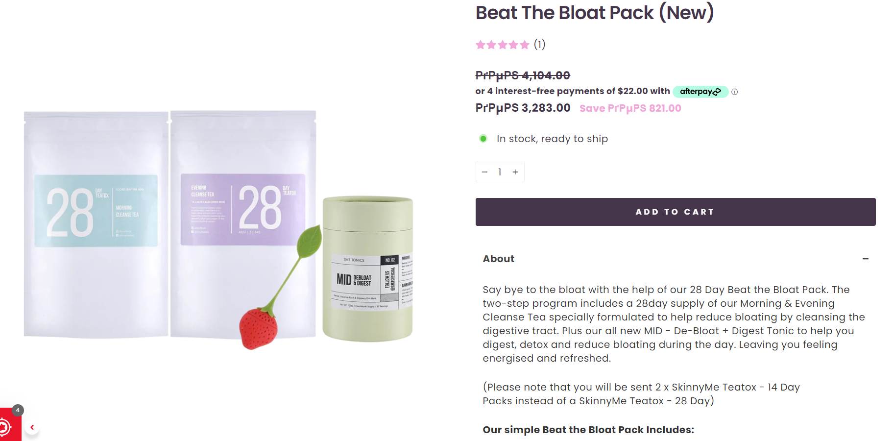
Link products together to create bundles. This strategy can make purchases seem more valuable and sometimes cheaper, encouraging customers to buy more.
Not every store offers bundles, so it can make you stand out.
For example, SkinnyMeTea uses product bundles to boost conversion rates and even has a dedicated “bundles” category.
12. Offer Discounts
Offering discounts can significantly increase your buying rates, especially when combined with bundles.
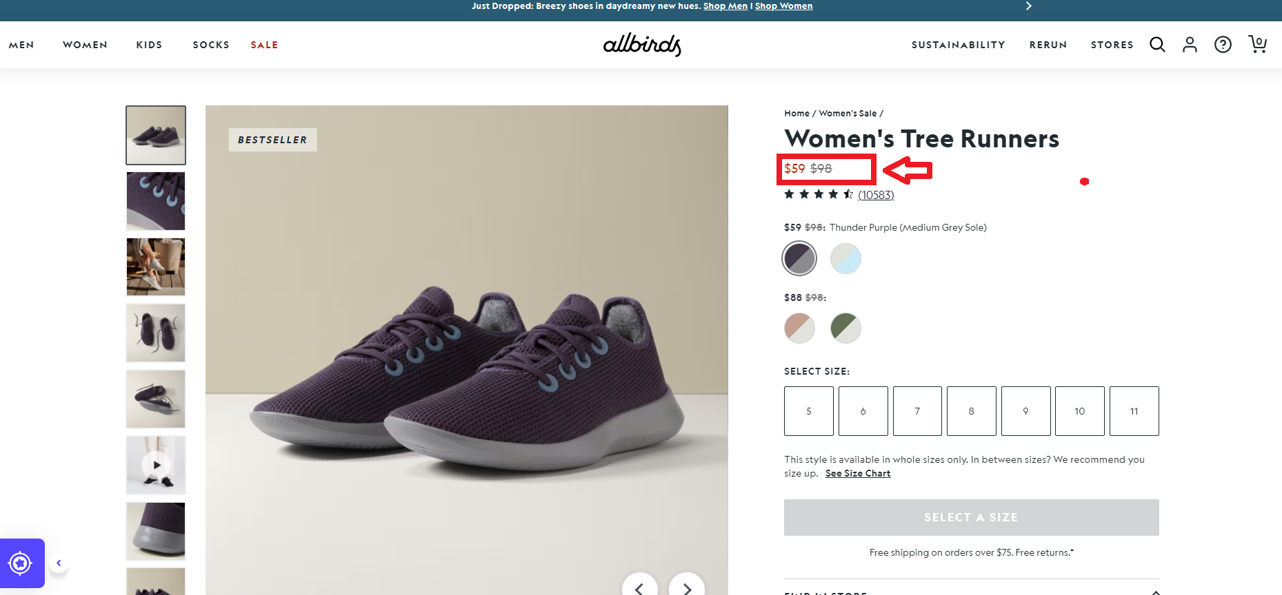
Customers love a good deal, so putting an expensive product at a discount can create urgency and drive sales. So, more customers, more conversions, better product page optimization.
Thus, take advantage of popular discount holidays like Black Friday and Christmas to offer special deals. Shopify provides various discount options you can offer to your customers.

13. Avoid Intrusive Pop-ups
Pop-ups can be useful if they are not too pushy. Ensure the message is clear and includes one action, using trigger words like “discount,” “now,” “free,” “get,” and “buy.”
So, if you add a pop-up, I advise you to make sure your CTA buttons stand out with eye-catching colors and large text.
Also, timing is crucial—avoid entry pop-ups, which can irritate visitors. Instead, use well-timed exit intent pop-ups with clear incentives to retain potential customers.
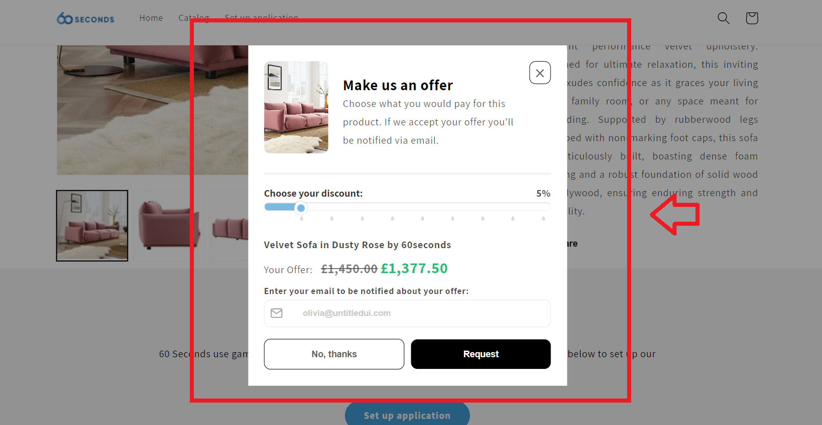
For instance, the 60-second app lets you experiment with different designs to find what works best for your business. Thus, the tool appears like a pop-up on your product page and lets customers set predefined discounts.
14. Include Shipping & Return Details
Including clear shipping and return details on your product pages is vital for building trust, improving customer satisfaction, and improving your product page optimization.
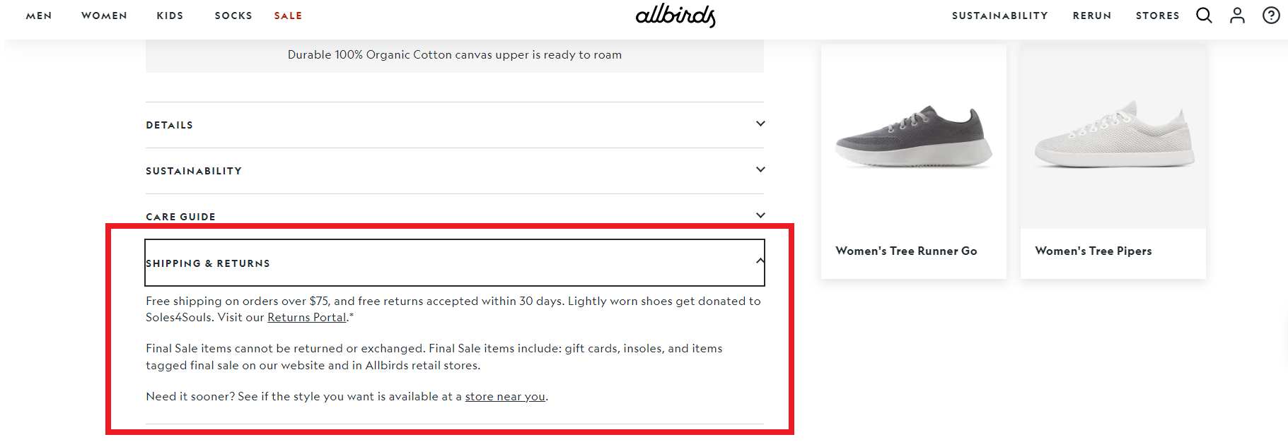
So, on your product, you can include tabs labeled “Description,” “Reviews,” and “Shipping & Returns.”
Customers want to know how and when they will receive their orders. Provide detailed shipping information including shipping options, costs, and estimated delivery times.
For example, you can offer standard, expedited, and overnight shipping options with corresponding delivery times and costs.
Be transparent about any additional charges that may apply.
Thus, you can write something like, “We offer free standard shipping on all orders over $50. Standard shipping takes 3-5 business days, expedited shipping takes 2-3 business days, and overnight shipping is available for an additional fee.”

15. Use FAQs to Address Common Questions
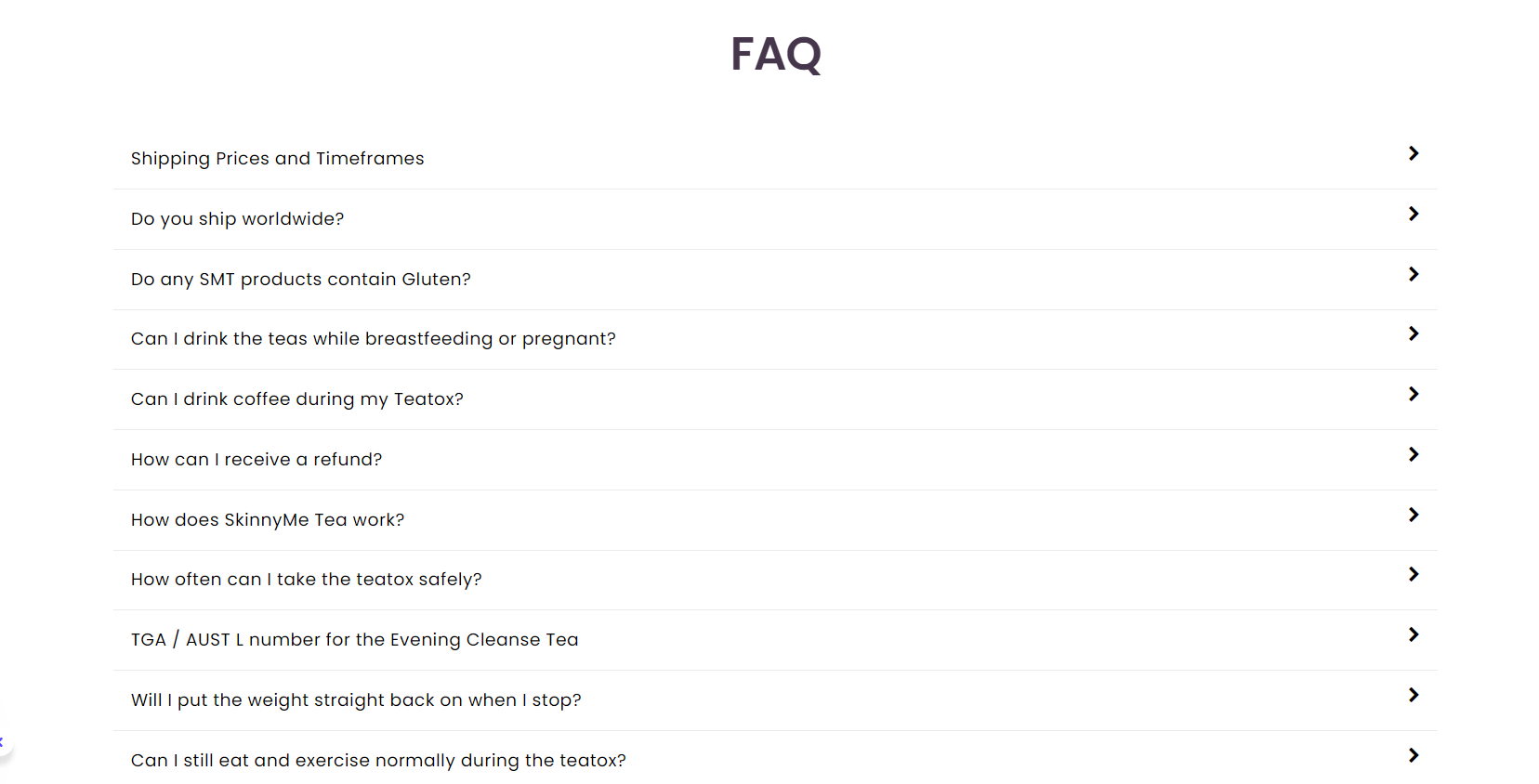
Adding a FAQ section about shipping and returns can preemptively address common customer questions. This not only improves transparency but also reduces the need for customer service inquiries.
For example, you can include FAQs like:
When will my order ship?
Orders are processed within 1-2 business days.
How can I track my order? You’ll receive a tracking number via email once your order ships.
What if I need to return my item?
For example, if you have no idea how to do it, you can use AI tools like ChatGPT and ask for help.
16. Include Size Charts
Including size charts on your product page is crucial for ensuring that customers can make informed purchasing decisions, especially when it comes to clothing, footwear, or any other size-dependent products.
So, make sure your size charts provide accurate measurements for each size. Include dimensions such as chest, waist, hips, and inseam for clothing, or length and width for footwear.
For instance, my size chart includes US, UK, EU, and Asian size conversions for customer convenience.
This helps customers find the perfect fit, reducing the likelihood of returns due to sizing issues.
Moreover, visual aids, like diagrams or photos, can help customers understand how to measure themselves correctly. This clarity can prevent confusion and ensure they select the right size.
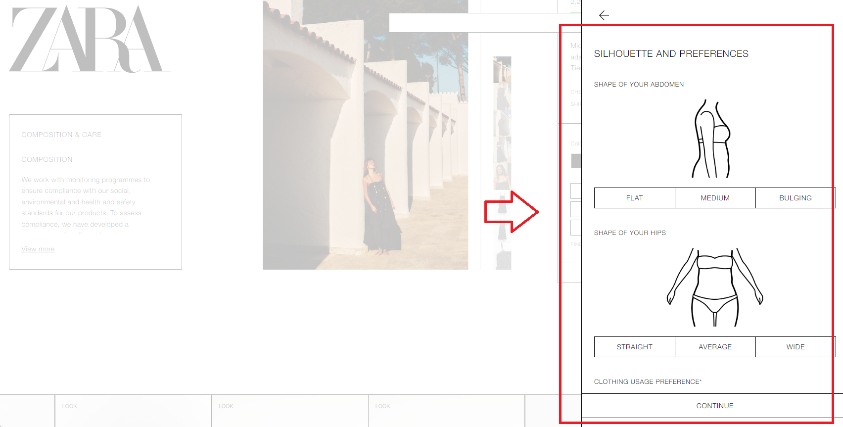
For instance, I love Zara’s size charts. In fact, they have all kinds of it, like table size charts, or even interactive size charts.
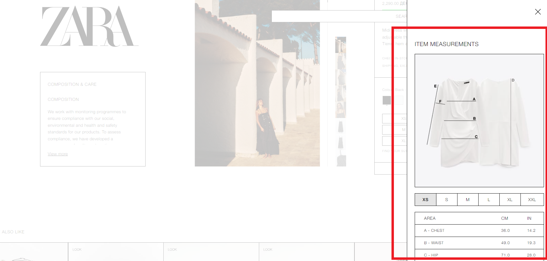
Hence, you can choose your body type and shape.
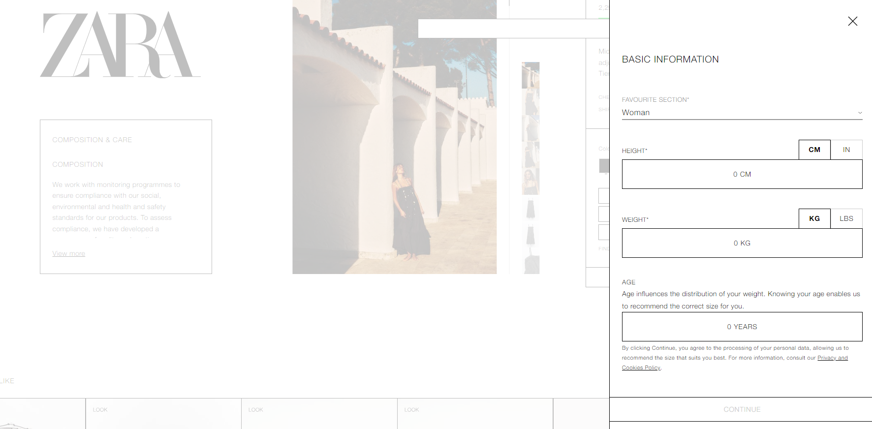
Plus, you can specify your weight, height, age, and how you like the product to look on you (looser, more tight), and get your right size.
17. Align with Ad Copy and Intent
Ensuring alignment with ad copy and intent is vital for maintaining user trust and improving conversion rates.
Consistency is key: the content on your landing page must match the promises made in your ad.
For example, if your ad promotes a 20% discount, the landing page should prominently feature this discount with a bold headline like “Enjoy 20% Off Your First Purchase!”
This alignment reassures visitors that they are in the right place and encourages them to proceed.
Additionally, using the same keywords on your landing page that are in your PPC campaign is crucial. This not only maintains relevance but also helps improve your Quality Score.
For instance, if your PPC ad targets keywords like “best running shoes,” ensure those exact words are featured prominently on your landing page.
Amazon effectively implements this strategy. When users click on an Amazon PPC ad for a specific product, they are taken directly to that product’s page, which prominently features the advertised deal or benefit.

18. Optimize Your Load Speed
Optimizing load speed is essential to keep visitors engaged and reduce bounce rates. Fast loading times are critical, as slow pages can frustrate users and drive them away.
To achieve this, optimize images and scripts to ensure quick loading. For example, compress large image files and use asynchronous loading for scripts.
For instance, tools like Google PageSpeed Insights can be invaluable for this process. They help identify performance issues and provide actionable recommendations.
For instance, if the tool suggests reducing server response times, you can work with your hosting provider to make the necessary adjustments.
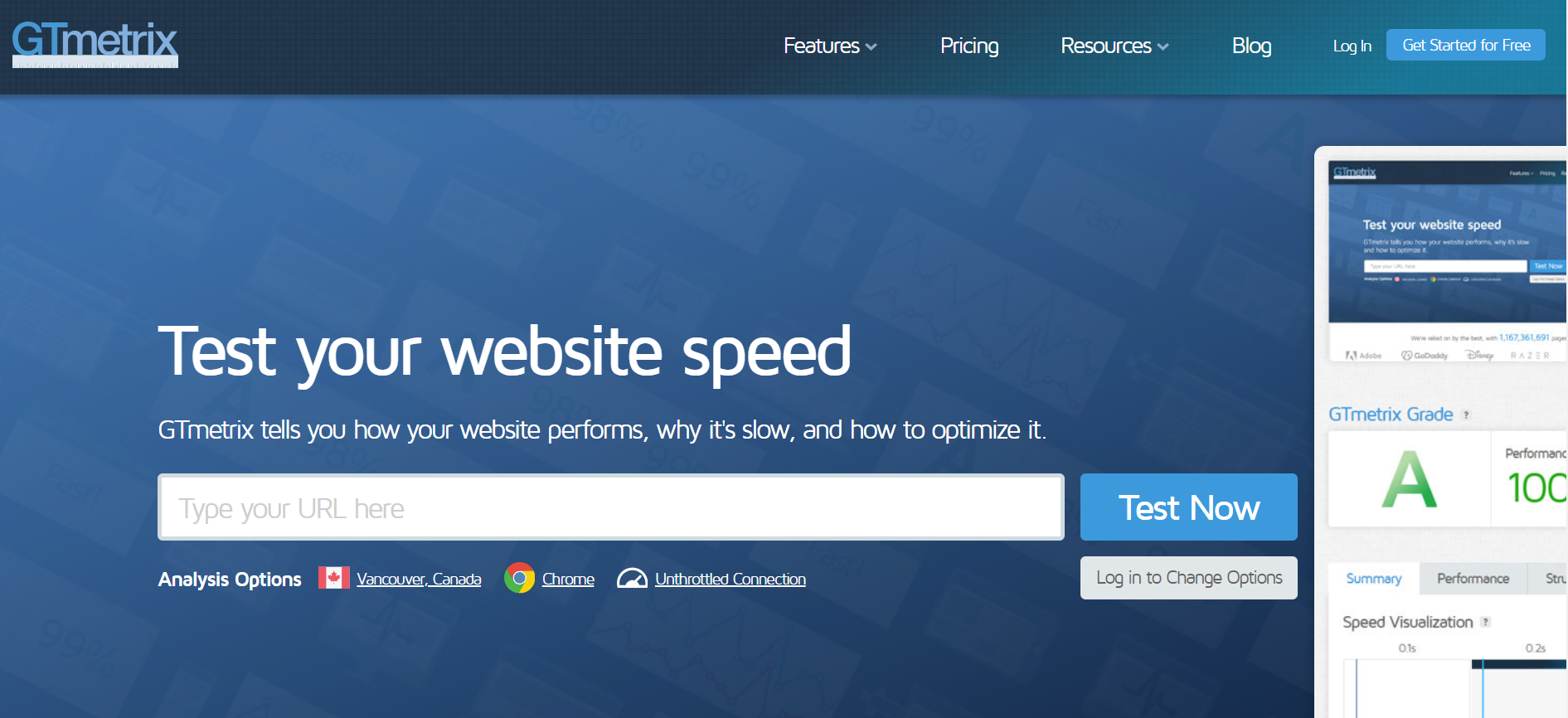
Thus, you can use tools like GTmetrix to gain detailed insights into your website’s performance. It offers a comprehensive breakdown of loading times and provides actionable suggestions to optimize your store, such as implementing browser caching and script minification.
19. A/B Testing
Conducting A/B testing is a continuous process that helps refine and improve your landing page.
Continuous testing involves regularly experimenting with different versions of your landing page elements, such as headlines, CTAs, and images, to determine which combinations perform best.
For example, you might test two different headlines: “Get Fit with Our Top-Rated Fitness Program” vs “Join Thousands Who Have Transformed Their Lives.”
Later on, you can analyze the results, you can see which headline leads to higher conversions.
Using the data from these tests allows for data-driven decisions. This means you can make informed changes based on what works best, ensuring that your landing page is always optimized for maximum effectiveness.
For instance, if a particular CTA button color results in more clicks, you can standardize this across all your campaigns.
Best Product Page Optimization Examples
Notebook Therapy
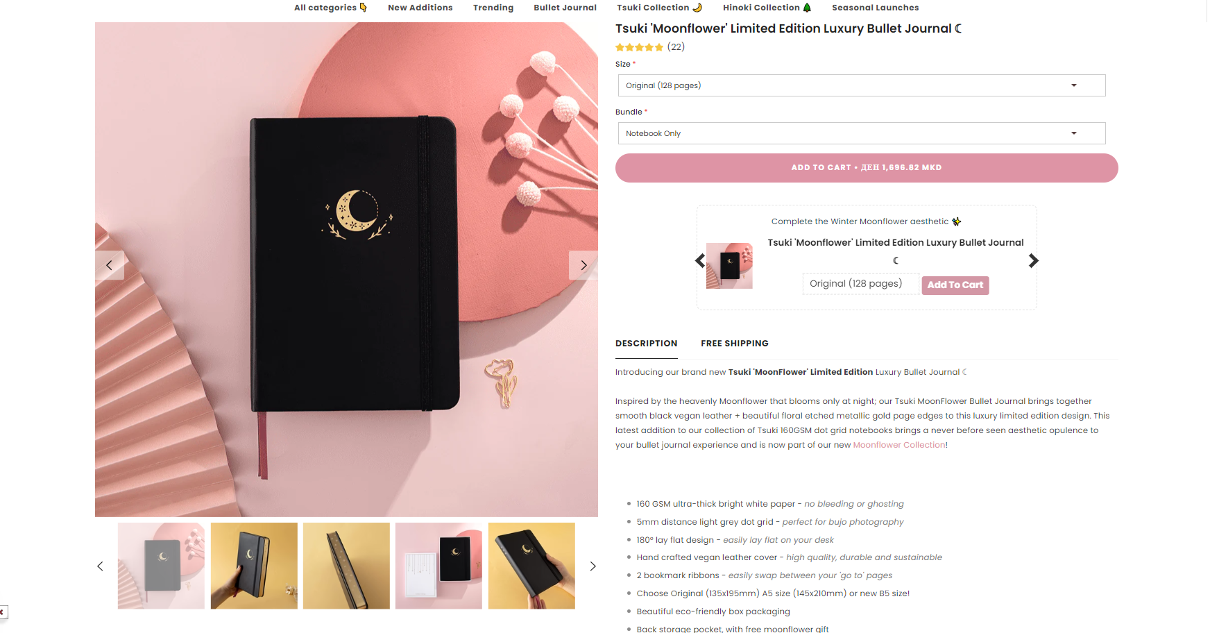
Notebook Therapy, a Shopify store, focuses on Japanese and Korean stationery, creating a vibrant and colorful shopping experience.
The product page optimization is meticulously designed, featuring in-depth descriptions, high-quality images, and essential call-to-action buttons like “Shop Now.”
The inclusion of a well-organized navigation menu enhances the user experience. What I love most is their use of Trustpilot reviews and a blog, which not only builds trust but also drives conversions.
Also, the overall design, including a $50 off pop-up, effectively engages customers from the moment they land on the site, making the shopping experience both enjoyable and efficient.
SkinnyMe Tea

SkinnyMe Tea, an Australian Shopify store, offers natural detox teas. The product pages are exemplary, with high-quality images, detailed descriptions, and call-to-action buttons like “Add to Cart.”
The homepage features a grid layout that effectively highlights important information without looking cluttered. What stands out is the engaging content, including customer testimonials and video testimonials, which build trust and credibility.
The overall design, with its emphasis on clear navigation and vibrant visuals, ensures a pleasant shopping experience, making it easy for customers to find and purchase their desired products.
Toyshades
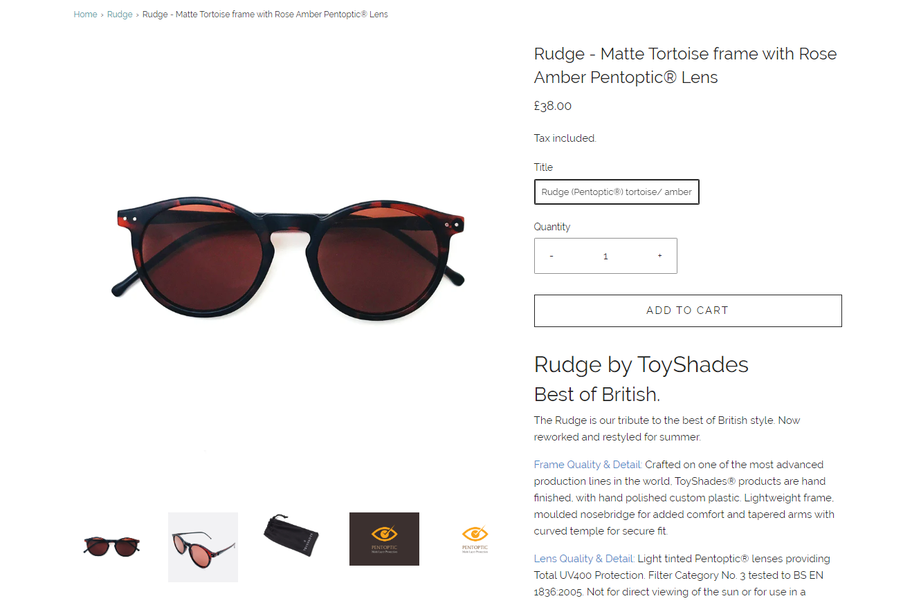
Toyshades, a Shopify store specializing in eyewear and accessories, impresses with its professional and well-organized layout.
The product pages are exemplary, featuring high-quality images, detailed descriptions, and essential call-to-action buttons. Also, the store uses a minimalistic design, with lots of white background which makes it look clean. Hence, you can see the breadcrumbs here, call-to-action buttons, and all the necessary details about the product.
The unique zoom-in option on photos provides a closer look at the products, enhancing the shopping experience.
Moreover, the overall design reflects the brand’s seriousness and dedication to quality, ensuring customers have a comprehensive view of the products, and making their shopping decisions easier and more informed.
HYFA
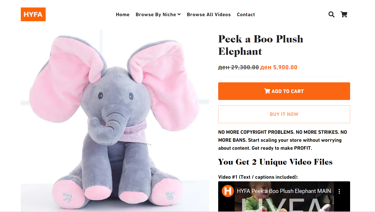
HYFA is a Shopify store that sells viral e-commerce videos. So, it really has its way with product page optimization. The product pages are neatly organized, with essential information like photos, videos, descriptions, and add-to-cart buttons.
What I love about HYFA is the “You may also like” and “Similar videos” sections on the product pages, which encourage further browsing and purchases.
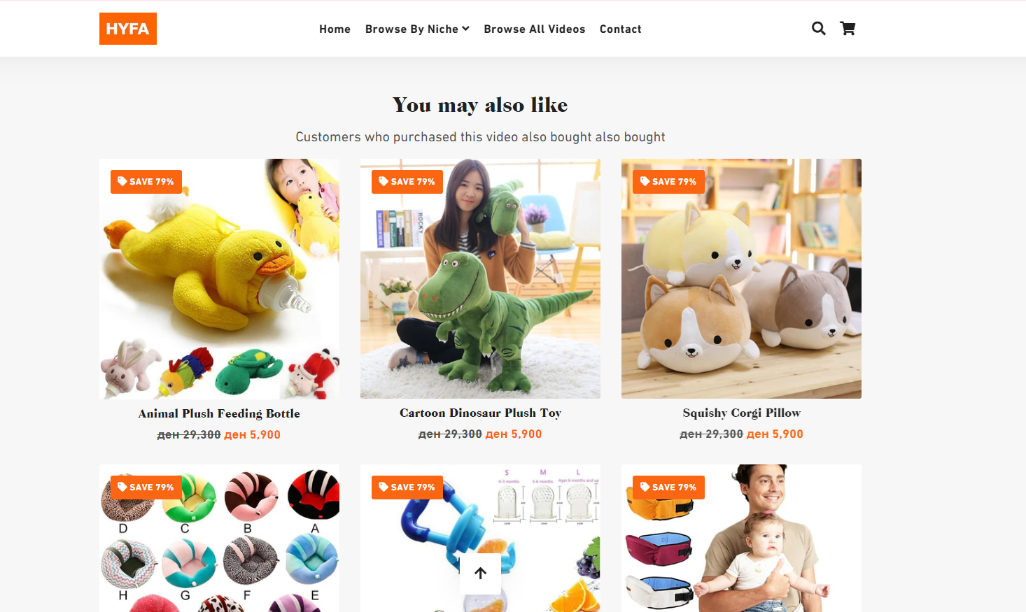
And of course, all the necessary details are here, descriptions, high-quality images, call-to-action buttons, etc.
The interactive elements and organized content layout provide a user-friendly experience that keeps customers engaged.
SKKN by Kim
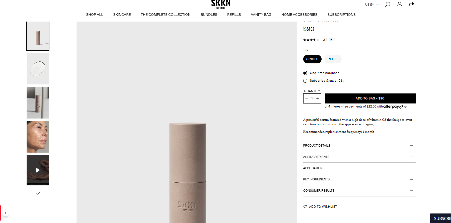
SKKN by Kim, a Shopify store owned by Kim Kardashian West, is a prime example of luxury and efficiency.
The product pages are flawless, featuring high-quality images, detailed descriptions, and various call-to-action buttons like “Buy Now” and “Add to Cart.” The use of a contrasting color for these buttons ensures they catch the customer’s eye.
The site’s design is organized into a grid layout, and the footer includes all essential categories and social proof elements.
The inclusion of digital gift cards, bundles, and subscription options further enhances the shopping experience, making it clear that SKKN by Kim is dedicated to both luxury and user satisfaction.
Flex
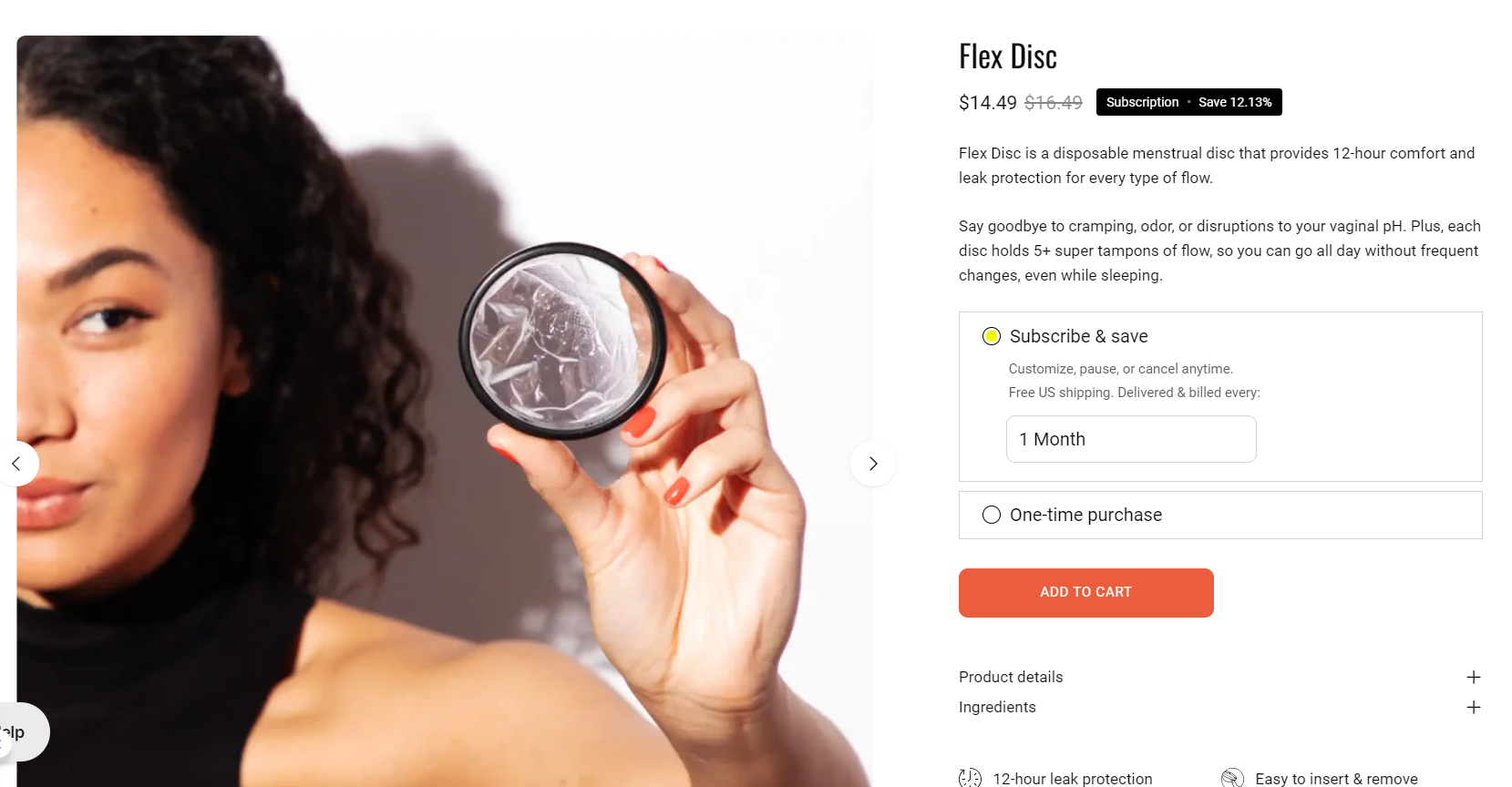
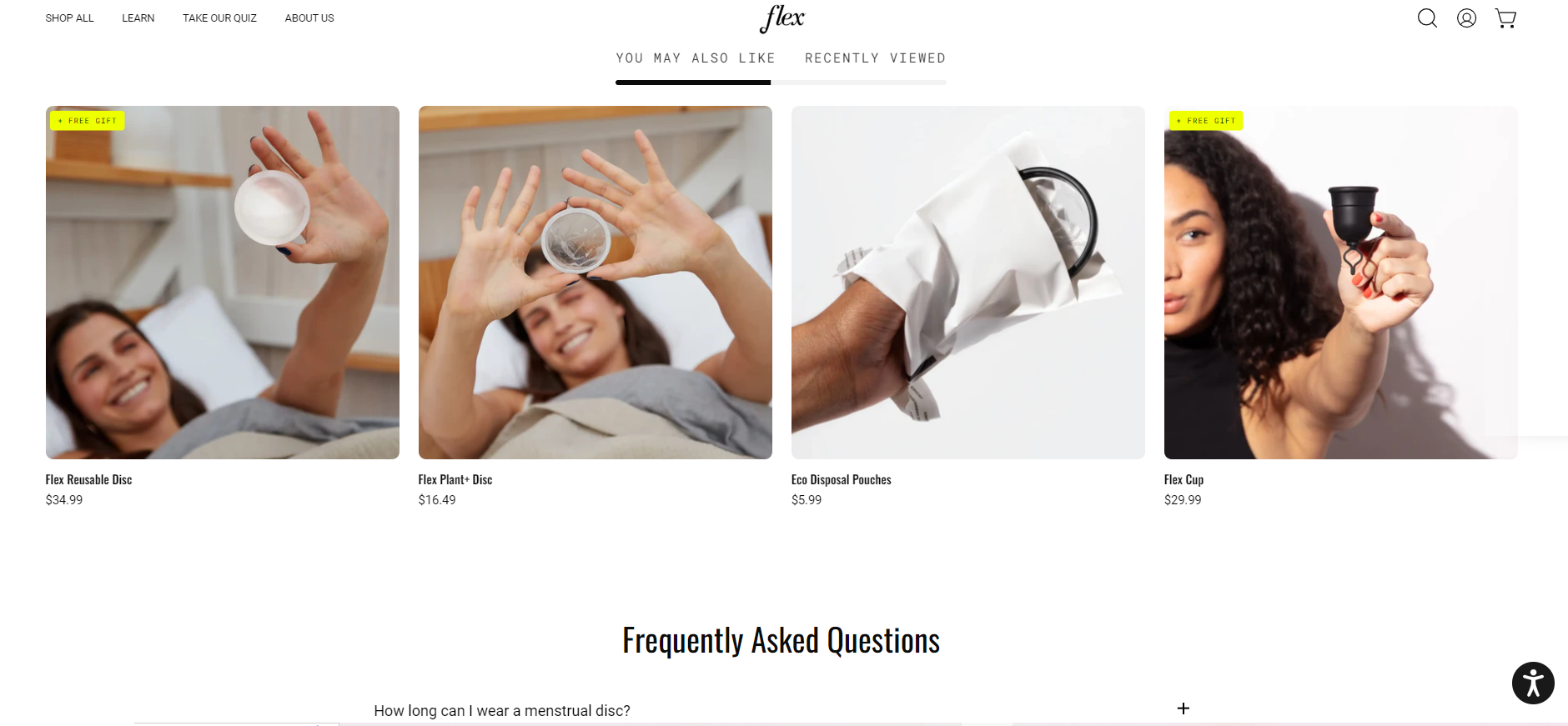
Flex, a Shopify store offering alternatives to tampons, stands out with its colorful and engaging design. The product pages are comprehensive, featuring high-quality images, detailed descriptions, and essential call-to-action buttons.
Also, their product descriptions are very informative in a creative way. I find this very entertaining. And, product reviews, “you may also like” section, FAQs – it’s all there!
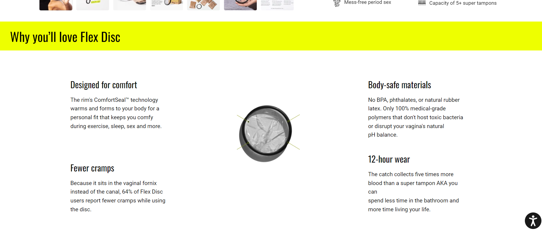
The menu is well-defined, making navigation easy, and the footer acts as a site map.
What I love about Flex is the inclusion of a quiz to help customers find the right products, along with a 24/7 live chat for customer support.
The overall design is user-friendly and visually appealing, enhancing the shopping experience by making it easy to find and choose the right products.
Unconditional
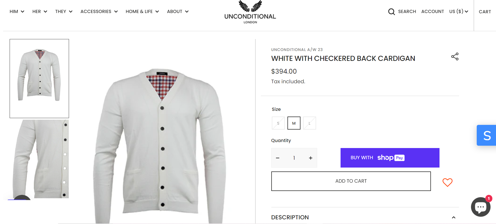
Unconditional is a great example of product page optimization. It started over 10 years ago in London and is renowned for its premium clothing.
Their product pages are a testament to high-end fashion, featuring high-quality images, comprehensive descriptions, and a detailed size guide. What truly stands out is the “You may also like” section, which encourages additional purchases.
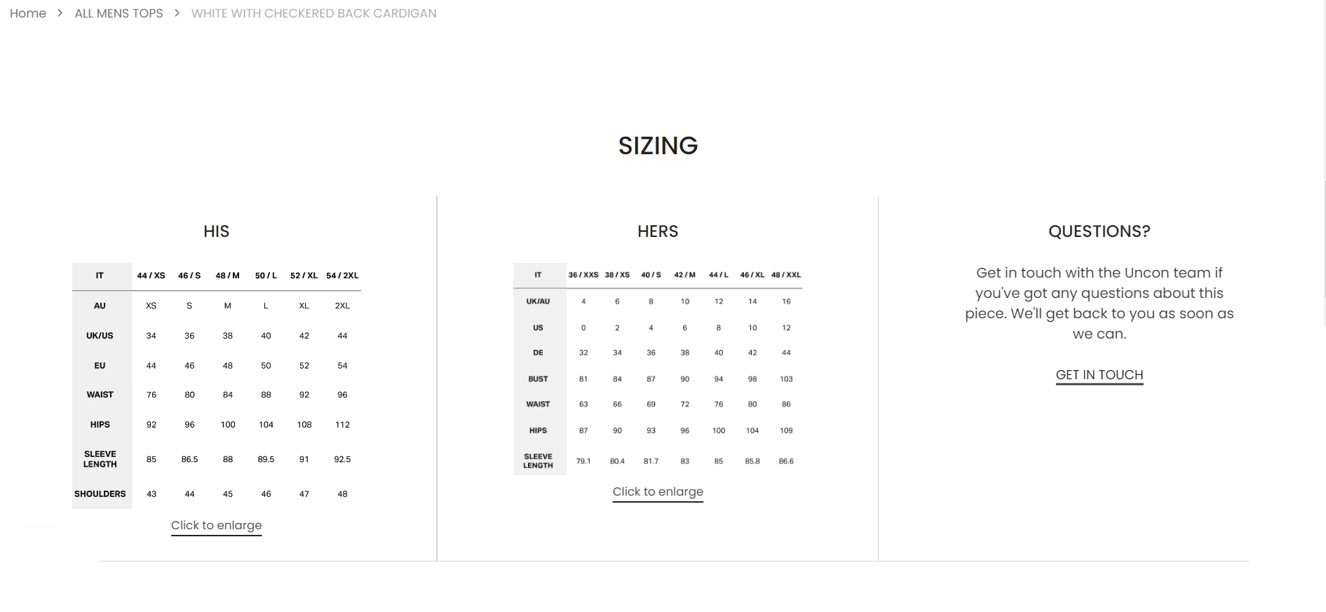
The seamless layout and attention to detail, such as the full-screen photos and engaging call-to-action buttons, create an immersive shopping experience.
The thoughtful design and engaging visuals make it clear that Unconditional is dedicated to providing a luxurious shopping experience.
7 Key Elements of an Optimized Landing Page
1. Compelling Headline
A compelling headline is crucial for capturing the visitor’s attention immediately.
For instance, if your ad promises a free eBook on digital marketing, your headline should reflect that, such as, “Get Your Free Digital Marketing eBook Now!”
This ensures the headline is both clear and attention-grabbing while aligning with the ad that brought the visitor to the landing page.
2. Strong Call-to-Action (CTA)
A strong call-to-action (CTA) needs to be highly visible and action-oriented. Place your CTA button prominently, ideally above the fold, so it’s easily seen.
Use action verbs like “Download,” “Sign Up,” or “Get Started” to make it compelling. For example, a fitness program landing page might use a CTA like “Start Your Free Trial Today” with a brightly colored button to draw attention.
3. Engaging Visuals
Using engaging visuals can significantly enhance your landing page. High-quality images or videos relevant to your offer support your message.
For example, if you’re promoting a travel package, include stunning images of the destinations to entice visitors. Ensure these visuals are strategically placed to guide the visitor’s eye towards the CTA.
4. Concise and Persuasive Content
Your landing page should have concise and persuasive content that clearly articulates the value proposition.
So, my advice is to use short paragraphs and bullet points to break down key benefits, making the content easily scannable.
For instance, a software product landing page might highlight benefits like “Increase Productivity,” “Enhance Team Collaboration,” and “Simplify Workflow” in a clear and focused manner.
5. Trust Signals
Incorporating trust signals such as testimonials, reviews, and trust badges can build credibility. For example, a landing page for an online course might feature testimonials from satisfied students and display badges from industry-recognized organizations.
Including these elements helps reassure visitors of the legitimacy and quality of your offer.
6. Mobile Optimization
Ensuring mobile optimization is essential as many users will access your landing page on their mobile devices.
This involves having a responsive design that looks great on all devices and ensuring fast load times to prevent high bounce rates.
For example, in my opinion, an e-commerce landing page should be fully functional on mobile, with easy navigation and quick loading of images.
7. Effective Form Design
An effective form design is simple and user-friendly. Keep forms short, asking only for essential information. Provide clear labels and instructions to guide users through form completion.
For instance, a newsletter signup form should just ask for a name and email address, with a clear “Subscribe Now” button.
So, ensuring forms are easy to fill out with large fields and clickable buttons can significantly improve completion rates.
Conclusion
Improving your product page optimization is crucial for transforming casual visitors into loyal customers.
Thankfully there are numerous effective strategies such as improving page layout, writing informative product descriptions, using high-quality images, and leveraging social proof, you can significantly boost your conversions.
Remember to make your pages mobile-responsive, utilize upselling and cross-selling techniques, and ensure fast load speeds.
Before you start, consider your target audience, the specific features of your products, and the overall user experience you wish to provide. And remember, investing time and effort into optimizing your product pages will pay off with increased engagement and sales.


![The Top 21 3PL Companies Compared [2025 List & Guide]](https://images.weserv.nl/?url=https://prod-dropshipping-s3.s3.fr-par.scw.cloud/2024/03/Frame-3922469.jpg&w=420&q=90&output=webp)